Sprechen Sie mit unserem Chef, wenn Sie die Lösung nicht gefunden haben
Unsere Chefin, Alanna, wird unser Team bitten, sehr bald eine Lösung zu finden! Sie müssen mit unseren Dienstleistungen zufrieden sein!
7x24 Unterstützung
Teilen Sie uns Ihre Projektdetails mit, und unser Team wird Ihnen in etwa 20 Minuten ein klares Angebot und praktische Vorschläge unterbreiten. Wir können Ihnen helfen, die Struktur und das Artwork zu verfeinern, weiße oder gedruckte Muster zu arrangieren, die Kosten zu optimieren und den Versand an Ihr Lager oder Fulfillment Center zu planen.
Fesseln Sie Ihr Publikum mit individuellen Display-Boxen: Ein umfassender Leitfaden
Wenn ich Ihr Display-Karton wäre, würde ich meinen Kopf ein wenig neigen, meine gestanzten Schultern ausrichten und sagen: “Lass mich lächeln, damit dein Produkt verkaufen kann.” Eine Display-Verpackung ist nicht nur ein Halter - sie ist ein Bühnenbild, ein Verkehrsmagnet und ein stiller Markenlehrer, der den ganzen Tag ohne Kaffee arbeitet.
Inhaltsübersicht
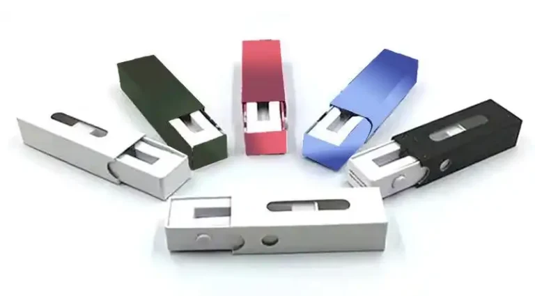
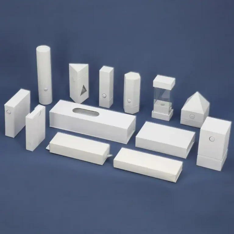
Was ist ein kundenspezifischer Display-Kasten?
Ein maßgefertigter Displaykarton ist eine speziell angefertigte Verpackung, die im Blickfeld des Käufers steht und seine Augen, Hände und Gedanken zu einem schnellen Ja lenkt. Betrachten Sie sie als Point-of-Decision-Medien: Struktur plus Grafiken, die schnell erklären, übersichtlich anordnen und Ihr Produkt sofort begehrenswert erscheinen lassen. Eine breite Auswahl an Formaten finden Sie in der Pappaufsteller Hub, oder schauen Sie einfach im Homepage weit zu starten.
Wie Display-Verpackungen die Leistung des Einzelhandels steigern
Stoppt das Blättern (im wirklichen Leben): Eine plakative Kopfzeile, eine saubere Produktaufteilung und ehrliche Behauptungen reißen die Kunden aus dem Autopiloten.
Erklärt, ohne zu belehren: Gute Anzeigen verwenden einfache Hierarchien - Nutzen, Hinweise, Anleitungen -, damit die Menschen in weniger als ein paar Sekunden lesen, entscheiden und zugreifen können.
Verwandelt kleine Räume in große Ergebnisse: Theken, Endkappen und sogar Paletteninseln können Ihre Geschichte transportieren, wenn das Personal im Verkaufsraum beschäftigt ist.
Wenn Ihre Kategorie Schönheit ist, ist ein aufgeräumter Thekenpräsenter wie der Kosmetikdisplay hält die SKUs aufrecht und zum Auswechseln bereit, während die Kopfzeile für sich selbst spricht.
Wählen Sie den richtigen Stil für Ihren Kanal
Zähleranzeigen (PDQ-Tabletts): Perfekt für Kassenzusätze und Testgrößen. Erwägen Sie ein vorgefülltes, leicht abreißbares Design wie das PDQ-Thekenständer um die Einrichtung des Geschäfts zu beschleunigen.
Bodenanzeigen: Wenn Sie auf der anderen Seite des Ganges präsent sein müssen, sollten Sie mit einer vertikalen 4-stöckiges Bodenregal für Getränke die die Belastung und die Sichtverhältnisse ausgleicht.
Paletten-Displays: Für Lager- oder Clubkanäle sind modulare Stellflächen wie die Paletten-Display-Ständer Wirkung und schnelle Wiederauffüllung.
Bewegung und Medien: Wenn Ihr Produkt von Demo-Visualisierungen profitiert, ist eine videofähige 3-stöckige Bodenanzeige unterrichten kann, während es sich verkauft.
Design, das konvertiert: ein fünfteiliger Rahmen
Überschrift mit einem Verb. “Glanz in den 30ern verstärken” ist eine vage Beschreibung.
Ein visueller Held. Produkt in Gebrauch oder eine klare Packung - wählen Sie eines, nicht beides.
Mikrokopie in drei Schritten. Was sie ist, warum sie hilft und wie man eine Variante auswählt.
Disziplin Farbe. Verwenden Sie Markenfarben, um das Auge zu lenken: Kopfzeile > Claim > Preis.
Pfade berühren. Daumenaussparungen, saubere Aussparungen und die Aufforderung “Nimm einen” laden zum Handeln ein.
Bei schweren Gläsern oder Flaschen sollten die Regalböden mit Laschen oder Zwickelverstärkungen versehen sein; bei leichten Beuteln sorgen herausnehmbare Halterungen dafür, dass die vordere Reihe nach dem Greifen knackig bleibt. Wenn Ihre Artikel hoch und schlank sind, versuchen Sie es mit einem gestaffelten Rahmen wie dem Bodenaufsteller mit fünf Etagen die ein Umkippen verhindert und gleichzeitig die Verkleidungen maximiert.
Materialien, Festigkeit und Nachhaltigkeit
Gewicht der Wellpappe: Passen Sie die Rillen- und Wandstärke der tatsächlichen Belastung an, nicht dem Wunschdenken. Schwerer bedeutet nicht immer besser; gut platzierte Rippen können Wunder bewirken.
Finish für die Realität: Matt für blendende Beleuchtung; abriebfeste Beschichtungen an stark beanspruchten Kanten; wasserabweisender Lack in der Nähe von Kühlschränken.
Planetenschonende Entscheidungen: Fiber-first, minimale Laminierung und abnehmbare Kunststoffhaken, wo nötig. Wiederverwendung des Sockels und Auffrischung des Kopfteils, um den Abfall zwischen den einzelnen Aktionen zu reduzieren.
Druck- und Strukturtricks, die sich sehen lassen können
Eine Funkenregel: Wenn Sie eine Folie oder einen UV-Spot verwenden, sollten Sie darauf achten, dass das Wort oder das Siegel im Mittelpunkt steht - zu viel Glam wirkt laut und nicht hochwertig.
Ausgestanzte Fenster: Bieten einen Blick auf Textur oder Farbe und halten die Produkte sicher.
Logik des Nachfüllens: Versteckte hintere Vorratsbehälter oder Top-Load-Behälter sorgen für eine volle vordere Reihe, ohne dass täglich nachgefüllt werden muss.
Benötigen Sie eine größere Erzählfläche für die Einführung neuer Produkte? Eine caféfreundliche Vertikale wie die Einzelhandelsregal bietet Ihnen eine Kopfzeile für Ansprüche und QR-Hilfeinhalte.
Messen, was zählt
Facings vs. Reichweite: Wenn die Kunden zögern, können Sie sie mit einer Probierzone locken.
Erschöpfungsmuster: Wenn das unterste Regal zuletzt geleert wird, stellen Sie die Botschaften auf Augenhöhe ein; Augenhöhe ist nicht umsonst Kaufhöhe.
A/B-Kopfzeilen: Tauschen Sie wöchentlich Verben oder Vorteilszeilen aus; behalten Sie den Gewinner als Standardkit.
Quick Chooser: Anpassung der Lösung an das Szenario
Brauchen Sie einen kompakten Helden an der Kasse? → PDQ-Thekenständer
Platzieren Sie mich dort, wo die Augen sind, bringen Sie mir bei, in sieben Worten zu sprechen, und passen Sie die Größe meiner Regale an Ihre reale Welt an - nicht an den Traum einer Blaupause. Ich werde es Ihnen mit sauberen Verkleidungen, schnelleren Drehungen und Kunden danken, die stehen bleiben, lächeln und zugreifen.