Parlate con il nostro capo se non avete trovato la soluzione
Il nostro capo, Alanna, chiederà al nostro team di trovare la soluzione molto presto! Dovete essere soddisfatti dei nostri servizi!


I caratteri non si limitano a “dire” un nome sulla confezione, ma ne mettono in scena la performance. Il giusto carattere tipografico chiarisce cos'è un prodotto, ne inquadra le sensazioni e ne aumenta la rapidità di vendita. Nel packaging personalizzato, il design dei caratteri diventa una leva silenziosa che rafforza la memoria del marchio, accelera il processo decisionale e sblocca il potere del prezzo premium. Questo articolo traduce la tipografia da una questione artistica a un sistema di crescita: come usare il martellamento visivo, la sinestesia dei cinque sensi, la traduzione culturale e l'interazione intelligente per trasformare le lettere in ricavi.
Negli scaffali affollati, il primo compito è quello di fermare il potere. I caratteri devono stabilire un chiaro percorso di lettura: prima il logo, poi il nome del prodotto, infine la variante o il sapore. Utilizzate il contrasto di peso, l'altezza delle x e la spaziatura delle lettere per rendere questo percorso percorribile a distanza di un braccio. Le aperture più nitide e i contatori più alti migliorano il riconoscimento quando le confezioni vengono fotografate per le miniature del commercio elettronico, quindi lo stesso volto deve funzionare sia in corsia che in alimentazione.
Per fissare questo aspetto in tutte le referenze, codificate la vostra gerarchia in un sistema di packaging: tipo di display primario, descrittori secondari, microcopia. Inseritelo nelle linee guida e nelle specifiche di stampa, in modo che sopravviva alle modifiche dell'ultimo minuto. Quando la vostra griglia tipografica è affidabile, l'acquirente può riconoscervi prima di leggervi consapevolmente, proprio come dovrebbe fare un martello visivo.
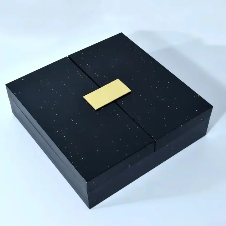
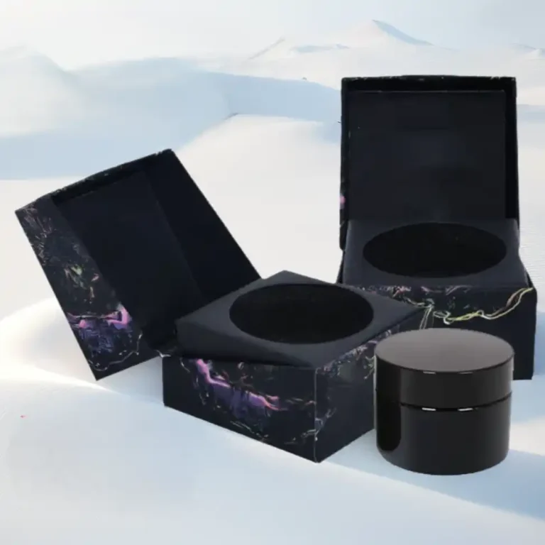
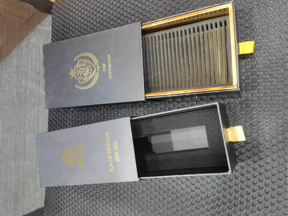
Esplorate le strutture che rendono la gerarchia tipografica semplice nella produzione reale, come i formati di allestimento rigidi o gli sleeve premium in categorie come scatole regalo in carta e substrati ingegnerizzati come cartoni pieghevoli. Per le tecniche di logo che amplificano l'impatto a prima vista, esaminare i metalli e il deboss su campioni simili a questo. scatola regalo magnetica di lusso personalizzata con logo in lamina d'oro.
La leggibilità non è un'opinione, è misurabile. Verificate le dimensioni minime dei punti alle distanze di visualizzazione previste, controllate i rapporti di contrasto dei colori rispetto ai substrati e verificate i supporti sia patinati che non patinati. I dettagli serif che sembrano eleganti in un PDF possono riempirsi quando vengono stampati su carta strutturata; i sans ad alto contrasto possono sbocciare sotto una forte copertura di inchiostro. Eseguite sempre un prototipo con l'effettiva pila di finitura che userete: laminazione, lamina e vernice cambiano il peso percepito e la nitidezza dei bordi.
In caso di dubbio, rendete la linea chiave più audace di un passo e ampliate il tracking di 5-15 unità. Otterrete un riconoscimento senza sentirvi “gridati”.”
La stampa in lamina, l'UV spot e la goffratura cieca non si limitano a decorare le lettere, ma codificano il valore. Un frontale modesto con una lamina nitida può risultare più pregiato di un frontale decorativo stampato in piano. Per i marchi che utilizzano inserti, vassoi o gusci rigidi, considerare le finiture elevate presenti nei tipi di prodotto sotto servizi di stampa e SKU speciali come cartone pieghevole stampato personalizzato per cosmetici con logo lucido.
Il cervello collega la consistenza visiva alle aspettative tattili. Un sans geometrico con un'ampia spaziatura segnala morbidezza e pulizia; un serif ad alto contrasto con sottili linee di capigliatura allude alla fragilità e alla cura. Traducete queste aspettative nella scelta del supporto e del rivestimento, in modo che il tatto corrisponda alla promessa. Se le lettere sussurrano “seta”, fate in modo che la laminazione sia come tale.
Le interruzioni di riga, la lunghezza delle parole e la larghezza delle lettere imprimono un ritmo. Le parole compatte e incisive di un carattere condensato si leggono velocemente: l'ideale per prodotti energici. Parole lunghe e aperte in un serif elegante rallentano il ritmo, ideale per le narrazioni di lusso. Usate questo ritmo per guidare il microcopy: i verbi in primo piano per la velocità, gli aggettivi in secondo piano per il tempo di permanenza.
Per le confezioni di prodotti alimentari, di bellezza e di profumi, la forma e la spaziatura delle lettere indicano le note di sapore e le famiglie di aromi. I terminali arrotondati possono suggerire cremosità; i dettagli angolari implicano scorza o spezie. Sui pannelli secondari, considerate una mappa del gusto o una ruota degli aromi espressa tipograficamente - pesi più leggeri per le note delicate, più pesanti per le note di base - in modo che il design delle informazioni e la voce del marchio si fondano.
Se avete bisogno di testare varianti in piccoli lotti, i flussi di lavoro di stampa digitale disponibili in categorie come prodotti rendono pratico l'A/B degli spunti tipografici senza doverli rielaborare.
I marchi globali spesso ricorrono a cliché quando “localizzano” i caratteri. È necessario invece identificare i valori culturali che si vogliono esprimere - raffinatezza, vitalità, artigianalità - e scegliere strutture di lettere che segnalino questi valori senza scadere nel pastiche. Per esempio, le famiglie di sans umanisti comunicano calore e alfabetizzazione in tutti i mercati, mentre i serif transitori codificano il patrimonio senza sembrare arcaici.
Creare una tavolozza di font con tre livelli:
Mantenere la spaziatura, le proporzioni e le griglie di base in modo che l'insieme venga letto come un unico marchio e non come un patchwork.
Quando i pacchetti richiedono più lingue, date priorità alla parità ottica: allineamento dell'altezza delle x, equivalenza del contrasto dei tratti e grassetti comparabili per enfatizzare. Per i set di caratteri complessi, assicuratevi che le famiglie scelte offrano stili corrispondenti tra le varie grafie o utilizzate una tipografia ponte con caratteri neutri per le lingue secondarie per mantenere intatta la gerarchia.
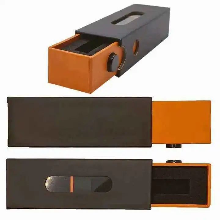
Per le categorie in cui è inevitabile la presenza di informazioni dense (ingredienti, cura o utilizzo), è preferibile scegliere formati con un ampio spazio interno o inserti, come le strutture rigide a cassetti e i documenti organizzati, come ad esempio stampa del manuale d'uso, in modo che la leggibilità non crolli sotto il testo di conformità.
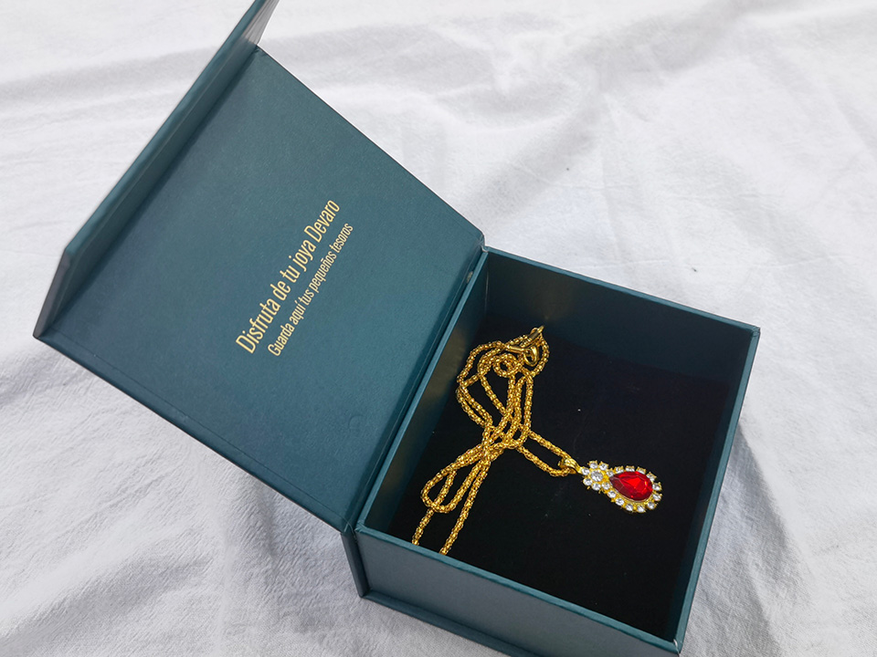
Gesti tipografici sottili - lo stile dei numeri, la scelta delle legature, il maiuscoletto per gli anni di fondazione - portano con sé la provenienza senza gridare. Abbinateli a materiali che riecheggino la stessa storia. Esplorate le strutture e le finiture su misura sotto scatole regalo in carta per lasciare che l'esterno rafforzi l'interno.
La tecnologia dei caratteri variabili consente una regolazione continua di peso, larghezza e inclinazione. Mentre le confezioni fisiche sono statiche, i master variabili consentono di generare un'opera d'arte perfettamente calibrata per ogni formato, substrato e finitura: un unico DNA di design reso conforme a molti vincoli. Gli stessi master alimentano l'e-commerce, i social e i POS senza introdurre derive fuori marca.
Pensate ai caratteri tipografici come a un passaggio, non a un'etichetta. Quando il tipo di titolo incornicia un QR scansionabile, un tag NFC o un modulo video stampato, coreografa il momento dell'interazione. Se prevedete di incorporare dei media, fate riferimento a formati di visualizzazione come brochure video per allineare la tipografia alle dimensioni dello schermo e alla distanza di visione.
Utilizzate i dati provenienti dalla vendita al dettaglio e dal D2C per iterare: stringete l'interlinea delle lettere sulle varianti più veloci; aumentate il contrasto per i display a barre in condizioni di scarsa illuminazione; aumentate il peso per i supporti opachi che consumano inchiostro. Con le funzionalità per le basse tirature in cartoni pieghevoli e i formati rigidi premium, è possibile inviare micro-ottimizzazioni senza aspettare le riprogettazioni annuali.
La prestampa intelligente non è solo per le immagini. Inserite le caratteristiche OpenType e le regole di legatura nei font del vostro marchio per evitare interruzioni di riga che danneggiano il significato, per scambiare automaticamente i numeri in linea con quelli in vecchio stile per la nutrizione o la narrativa e per imporre spazi non interrotti all'interno dei codici prodotto. In questo modo si riducono gli errori dell'operatore e si protegge il patrimonio del marchio su scala.
Per le palette complesse - ombretti, set di profumi, calendari dell'avvento - in cui la tipografia deve indicizzare molti articoli, si possono considerare vassoi modulari e custodie che accolgono i caratteri piccoli ma li mantengono leggibili, simili ai sistemi organizzativi visti in palette magnetiche vuote.
La tipografia sulle confezioni personalizzate è un sistema di profitto sotto mentite spoglie. Usate il martellamento visivo per conquistare il primo sguardo. Create una sinestesia in modo che le lettere suscitino aspettative di tatto, ritmo, gusto e profumo che i vostri materiali soddisfano. Traducete la cultura con rispetto e struttura, in modo che le confezioni globali vengano lette come un'unica famiglia. Infine, lasciate che gli strumenti intelligenti colleghino i caratteri all'interazione, ai dati e all'automazione. Quando sono le lettere a portare il carico, il design smette di essere un costo e diventa una risorsa che si arricchisce.