解決策が見つからなかったら上司に相談しよう
上司のアランナは、すぐに解決策を見つけるよう私たちのチームに依頼します!私たちのサービスに満足してください!


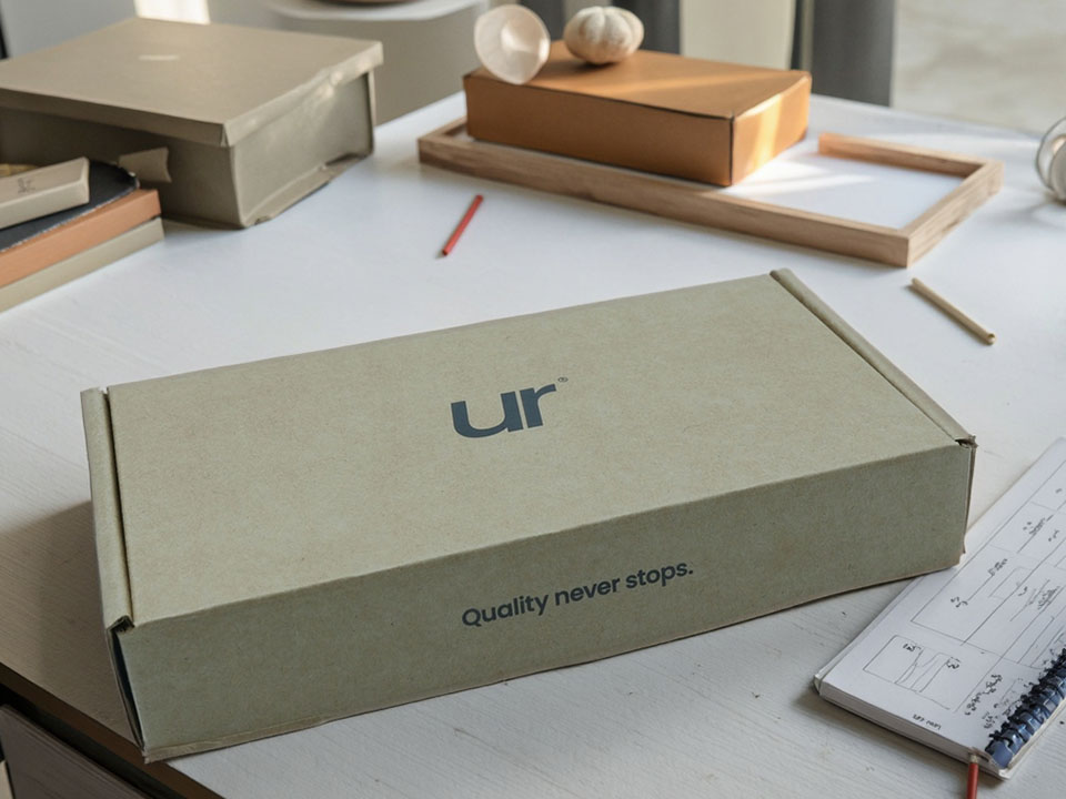
色には気分がある。昼間の光の下では陽気に目覚め、工場のLEDの下では騒がしくなり、コート紙の上では時々癇癪を起こす。包装ギフトボックス・メーカーとして、私たちはただ「インクを乗せる」だけではありません。あなたのブランドがくすんだり、ネオンになったり、変に紫がかったりしないように、私たちは色のお守りをします。通常の印刷・加工プロセスにおいて、印刷色の完全性を保つことは、現在進行中のパズルのひとつです。顧客にとって、一番避けたいのは色の違いです。ちょっとしたずれがデザイン全体を台無しにしてしまうからです。以下は、印刷の色収差(別名、目に見える色ずれ)を避けるための、実践的で実戦的なガイドである。.
TL;DR:光を標準化し、インクと紙を安定させ、既知のターゲットに印刷機を較正し、すべてを本気モードで測定する。そして、明日もう一度やること。.
パッケージングにおいて、色の違いは、最終印刷物が承認されたプルーフと一致しない場合や、あるバッチが次のバッチと異なって見える場合に現れます。その理由としては、メタメリズム(異なる光の下で変化する色)、インクの経年変化、基材の白さ、ラミネートやワニスのずれ、印刷機の不安定さ、湿度の変動、あるいは単にスポットカラーの混合が少しずれていることなどがあります。どれも “ミステリー ”ではなく、物理学であり、化学であり、クラフトのタッチなのだ。.
正午に “気に入った ”赤が、午後10時には茶色っぽく見えることがある。日勤の昼光色と夜勤のLEDでは錯覚が生じるので、私たちは印刷標準光(一般的にはD50)の下で見て承認する。現場では、ライトブースのチェックは日常茶飯事だ。ブースがなければ承認もない。うるさいようですが、再印刷の手間を省くためです。. 人間のメモ: ベテランのレディット・プレスオペは、派手なトリックを使わず、ただ適切な電球を使っただけである。文字通り、一夜にして。.
デザイナーはICCプロファイルを埋め込んだファイルを提供し、私たちはキャリブレーションされたモニターでソフトプルーフを行います。その後、ハードプルーフ/コントラクトプルーフを発行します-これが “ジャッジ ”です。プルーフに署名があれば、合意された許容範囲内で印刷に合わせます。良いプルーフは霧の中のコンパスのようなものです。.
パントンの見本は出発点であって、聖典ではない。顔料、ベースインキ、粘度、紙の白さが結果を左右する。経験豊富なインク技術者は、サンプルとターゲットが一致するまで、目や器具を使ってミックスを微調整する。ルールは単純だ:測定、調整、繰り返し。. クオラ流の知恵: 印刷会社はよく “パントンブックは印刷機ではない ”と言うので、ミックスはライブ・チューニングが必要だ。.
私たちはプルシートを標準的なライトボックスで見る。そのため、“あそこは問題なかった ”というような議論はなくなります。”
ある顧客からの報告:しばらくするとインクの色がくすむが、以前のロットは問題なかった。多くの場合、インクの賞味期限が近いか、温かく保存されているか、空気に触れすぎています。私たちはバッチの日付を追跡し、在庫を回転させ、実行前に素早くドローダウンを行います。古いインク?ハードパスです。まだ印刷はできるかもしれませんが、動作はしません。.
水性システムは粘度とpHで、UVインクは温度で、オフセットは水とインクのバランスで変化する。私たちは間隔を空けてモニターしています。液体が適切でなければ、色は定着しないからです。退屈ですが、これが仕事です。.
2枚の “白い ”ボードは、異なる色を反射することがある。同じボードでもロットが違えば色も変わります。私たちは 実際 基板から 実際 ロット。ラミネート(グロス/マット/ソフトタッチ)やニスも認識を変える。.
業界の目標値(グレーバランス/ニュートラル狙い、階調再現カーブなど)に合わせてキャリブレーションを行います。そうすれば、今日Aを押す≒明日Aを押す≒来月Bを押す。バイヤーにとって正確な略語は重要ではなく、習慣が重要なのだ。キャリブレーションされたプレスは、劇的ではないプレスである。.
すべてのフォームにカラーバーを走らせ、分光器でパッチを読み取り、証明書と照らし合わせてΔEのログをライブで記録する。もし数値がドリフトしたら、あなたの目が悲鳴を上げる前に修正します。測定器は議論するのではなく、ただ真実を伝えるのです。.
紙はスポンジのように湿度を吸収する。温度変化はインクの流れを変える。だから私たちは紙のコンディションを整え、RHを管理し、スタックを馴染ませる。小さなことのように聞こえますが、箱の安定性にとっては大きなことなのです。.
魔法のトリックはない。.
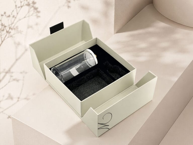
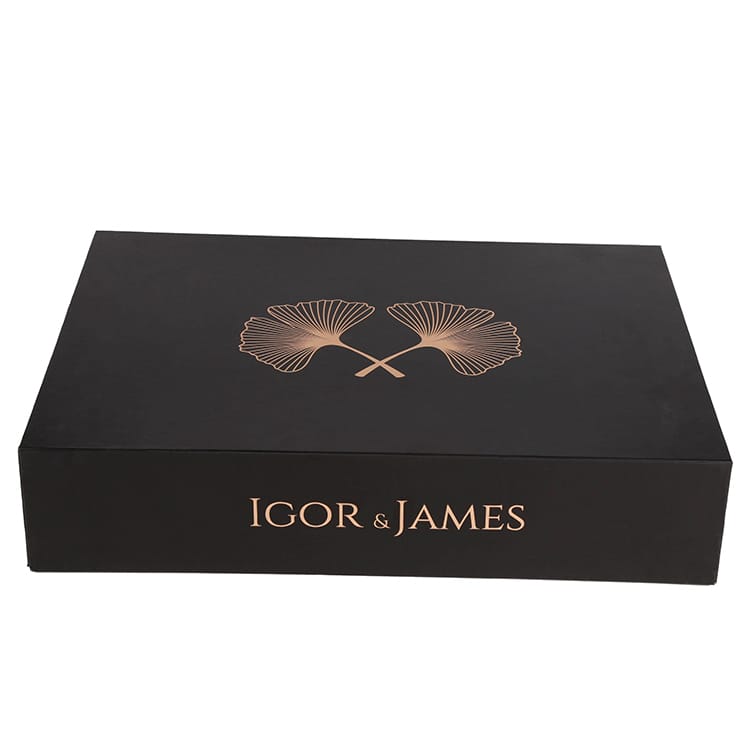
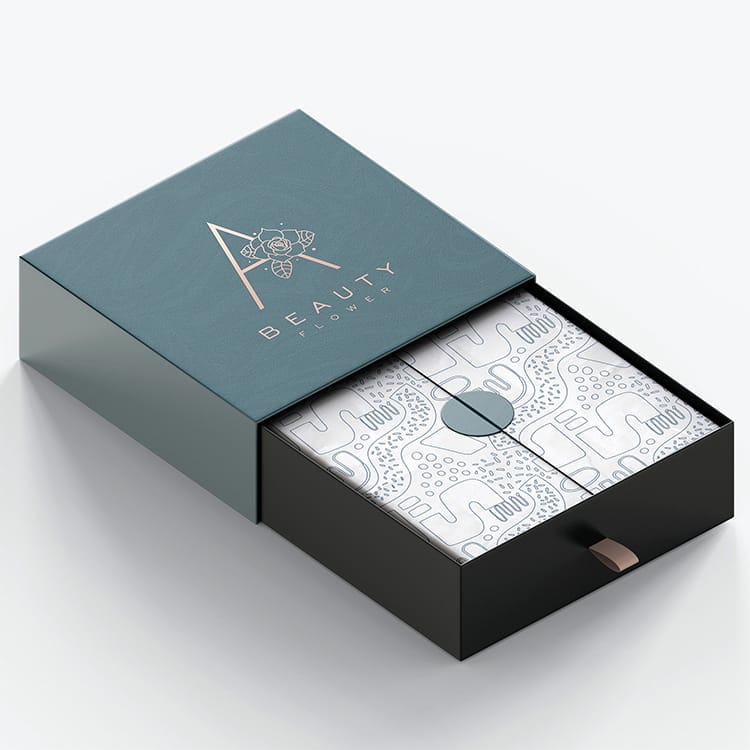
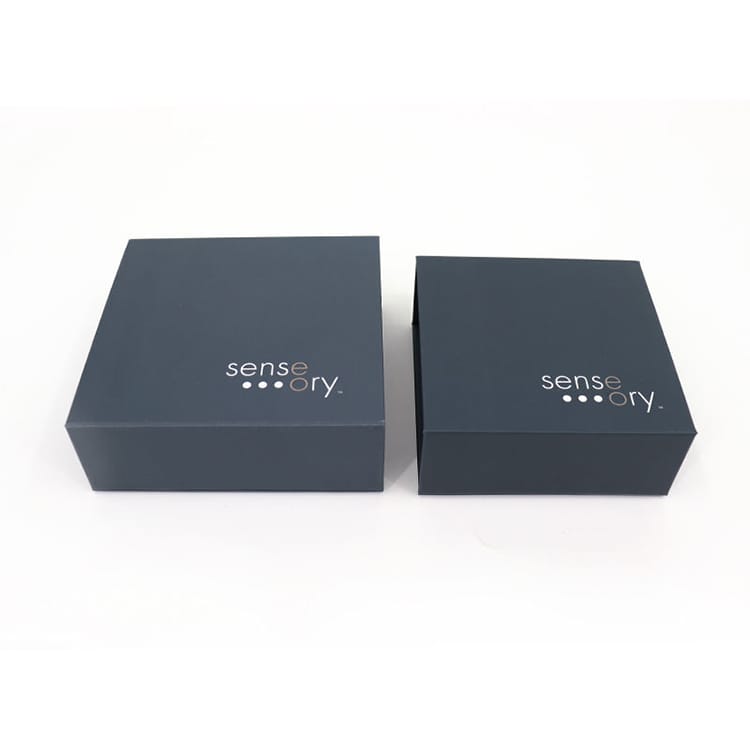
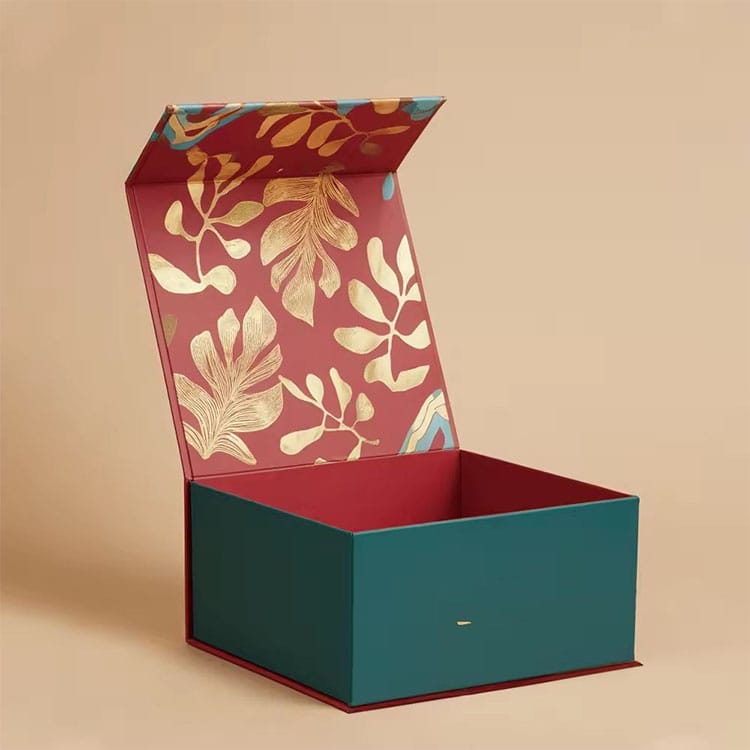
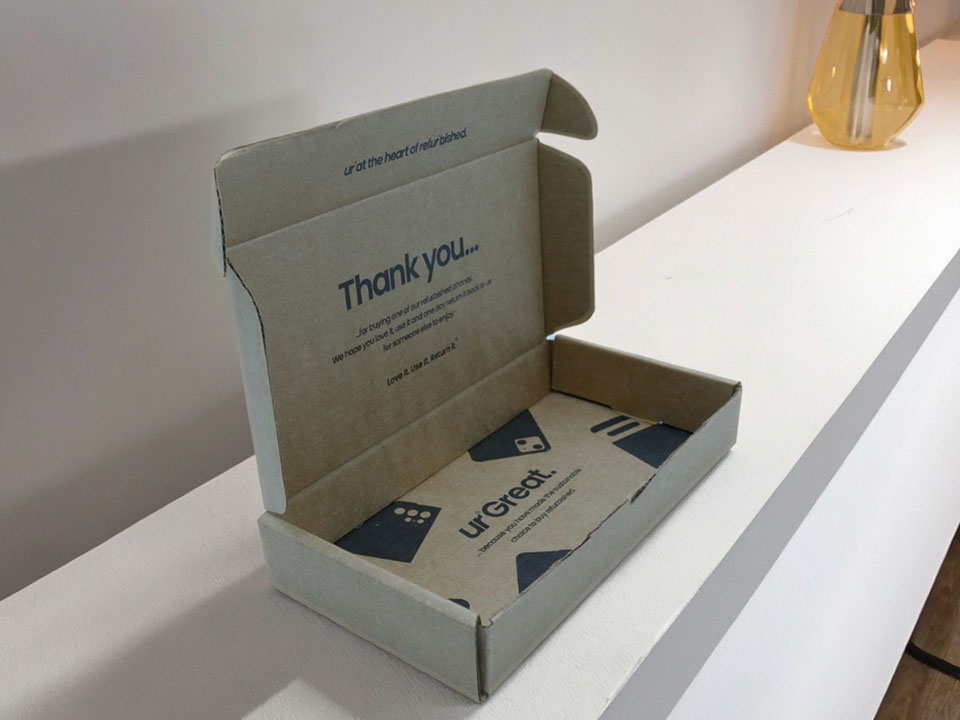
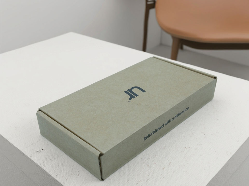
繊細なものから ペーパーギフトボックス 小売に対応 折り畳みカートン そしてタフ プリント段ボール箱, 私たちのチームは、すべての工程にカラーチェックを組み込んでいます。複雑な構造の 折りたたみ式マグネットギフトボックス または カラー段ボールメーラー-仕上げは色の知覚を狂わせる可能性があるため、特に注意が必要です。私たちがどのようにスペックとプルーフをさまざまな素材にわたって行っているかをご覧になりたい方は、私たちのウェブサイトをご覧ください。 印刷サービス 概要と 製品ギャラリー 典型的なフローを歩こう。そして、もしあなたがここに来るのが初めてなら...。ジバン包装 が玄関だ。.
自宅と店舗で箱の見た目が違うのはなぜですか? それはおそらく 体節制-同じインク、違う光。オフィスの照明だけでなく、常に標準的な光の下で色を判断してください。.
印刷用にRGB画像を送ることはできますか? できますが、印刷はCMYK+スポットで行います。適切なICCプロファイルで変換し、実際のボードでプルーフを承認してください。.
私のパントンはマットフィルムではくすんで見える。 壊れていない。マットとソフトタッチは光を散乱させ、知覚的な彩度を下げる。プレスで補正するか、別の仕上げを選ぶことができる。.
なぜ再注文が少しずつずれるのか? ボードのロット、インクのバッチ、印刷機のコンディション、天候でさえもドリフトする可能性がある。校正+測定+プルーフィングによって、そのドリフトを「人間のあえぎ」のライン以下に抑えることができる。.
メタリックとネオンは挙動不審? ちょっと大げさなんだ。慎重なバッチ管理と現実的な許容範囲に期待したい。.
色はロボットじゃない。光、紙、インク、そして時間によって呼吸しているのだ。印刷の色収差を “打ち負かす ”方法は、1つのトリックではなく、ルーティンです:ビューイングを標準化し、材料を安定させ、印刷機をキャリブレーションし、そして、ポイントを証明するように、すべての印刷を測定します。そうすれば、あなたのブランドカラーは、今日も、来月も、そして次のキャンペーンでも、あなたが思い描いたとおりに現れるでしょう。.