Talk To Our Boss If You Didn't Find The Solution
Our boss, Alanna will ask our team to find out the solution very soon! You must be satisfied with our services!


If cream product packaging might speak, it would certainly guarantee three things at the rack: I’m risk-free on your skin, I’m simple and easy to utilize, and I look worthy of your vanity room. Turning that guarantee into truth indicates aligning R&D, packaging design, layout, and operations around one playbook– materials with tried and tested health, structures that protect and joy, ends up that elevate without mess, and sustainability that’s real, not simply attractive duplicate.
Begin with cosmetic-appropriate substrates for jars, caps, and pumps. Pair PP or PET bodies with tight-tolerance closures and induction-sealed liners to lock in freshness and provide tamper evidence. Where actives are oxygen- or light-sensitive, specify barrier layers in pumps or inner cups and keep metal trims out of the headspace by isolating them with liners.
Use low-migration ink systems and stable varnishes (matte, soft-touch, anti-scratch) that won’t bloom or shed. Lock down adhesive specs early; label lift and foil peel are small failures that erode premium cues and can contaminate fill lines.
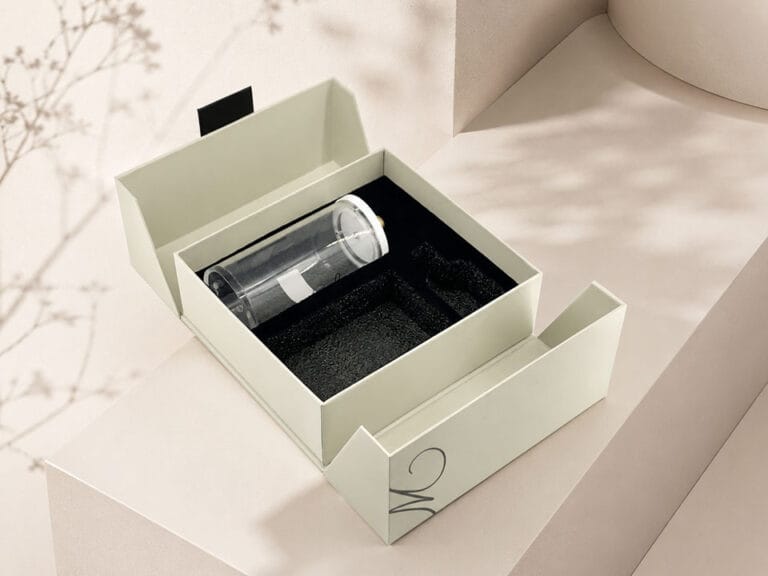
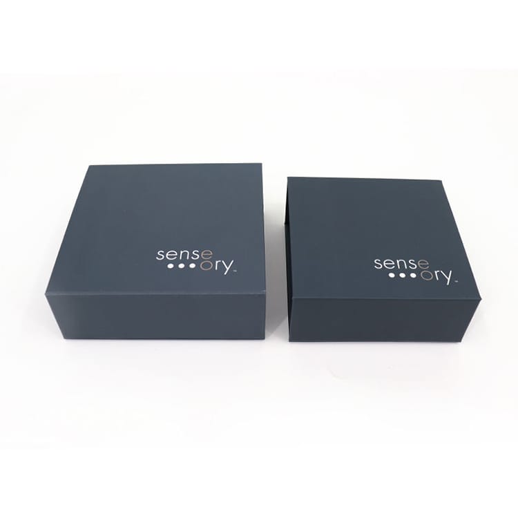
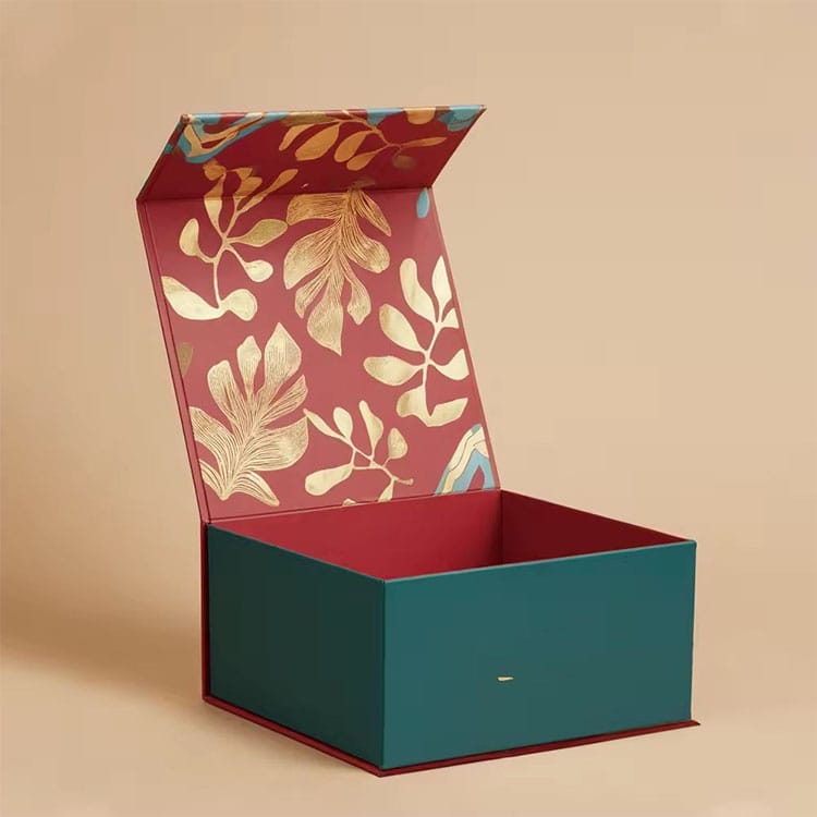
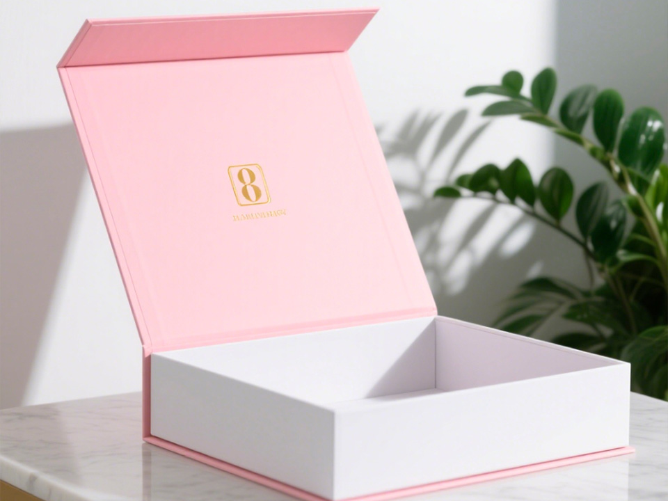
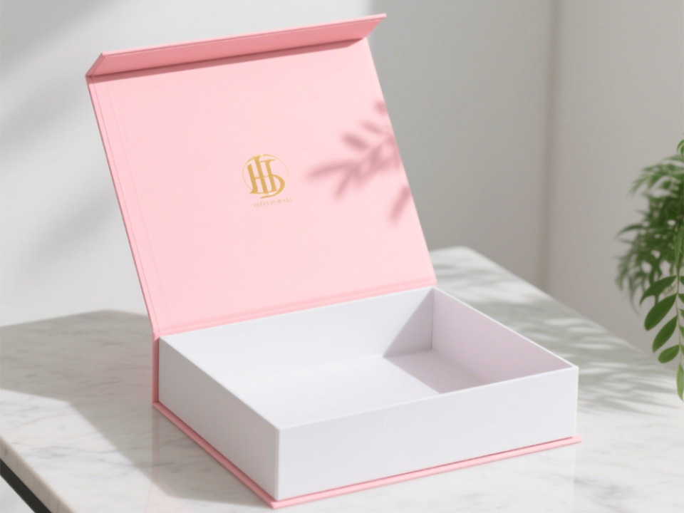
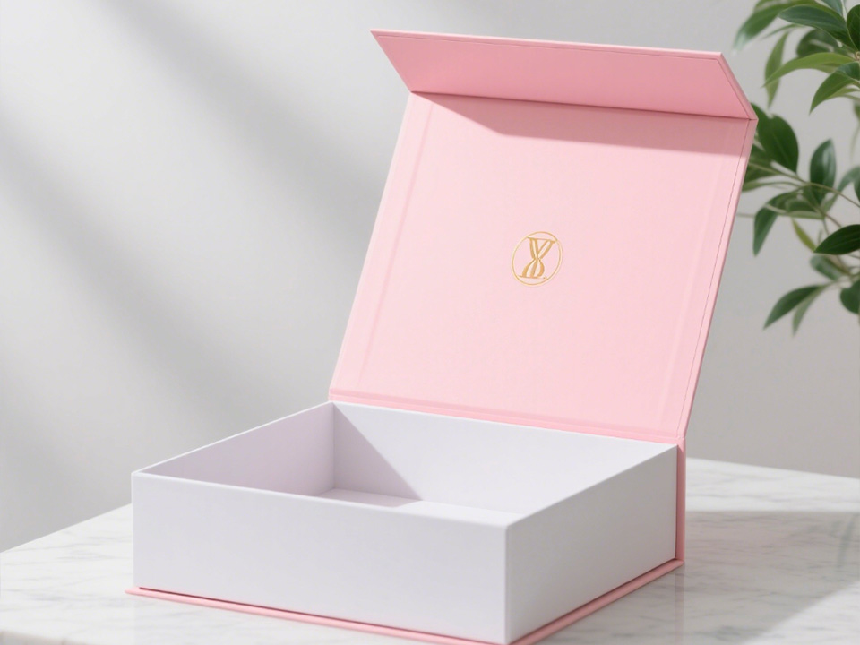
Cream jars bruise easily—design the outer pack to absorb shocks so the vessel arrives pristine. Real-world options your team can source today include:
For a quick overview of capabilities and direct contact options, start at the homepage.
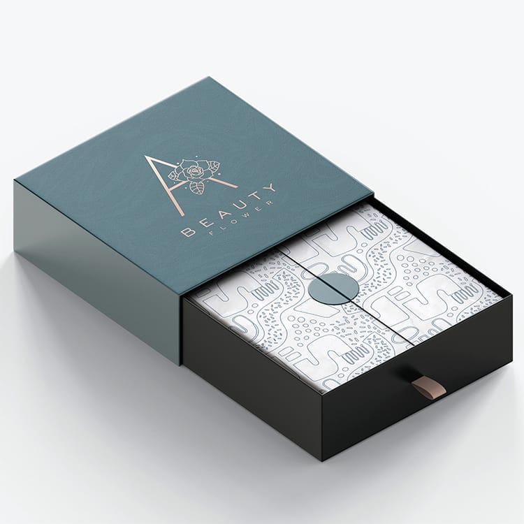
Treat the front panel like a three-second billboard: product name, primary benefit, and net weight. Use typographic contrast that remains readable under bathroom lighting and after varnish. Keep microcopy (claims, usage) crisp and positioned away from high-touch edges that can scuff.
Matte or soft-touch lids cue skincare sophistication; add restrained foil or spot UV to highlight hero claims without turning the pack into a mirror. On rounded jars, align seam breaks with threads so the silhouette reads clean from any angle.
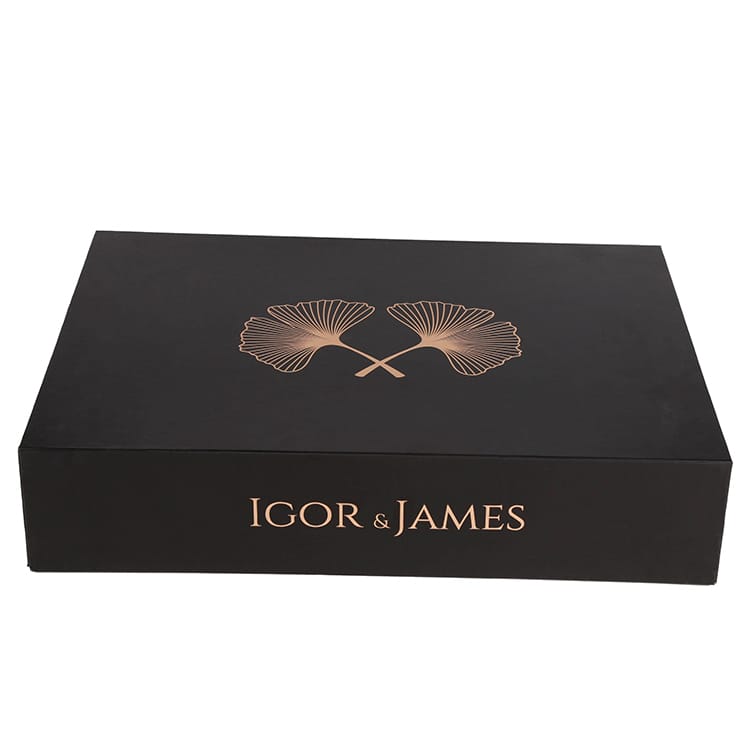
Specify opening torque that works with damp hands. Consider a protective disc and dedicated spatula dock to avoid loose parts scratching the jar. Premium cartons with magnetic closures or ribbon assists elevate unboxing while keeping the primary container immobilized.
Airless pumps and jars reduce oxygen ingress and eliminate finger dipping—excellent for active formulas. If a classic screw-top is the brand code, pair it with an induction seal and a rigid protective disc to maintain integrity after first open.
A firm “click” on re-close is a silent quality signal. Embossed spoon marks or metered pumps help consumers follow regimens and avoid overuse, improving satisfaction and product longevity.
Validate against common drop, vibration, and compression profiles. Use molded pulp or foam cradles sized to prevent micro-abrasions on soft-touch finishes, and right-size outers so panels don’t crush during last-mile handling.
Mono-material builds—mono-PP or mono-PET bodies, lids, and labels—simplify downstream sorting. Choose wash-off or peelable label systems and avoid heavy mixed-material accents that contaminate streams.
Introduce PCR in color-forgiving components first (caps, spacers) and scale up as shade control stabilizes. Communicate with plain, verifiable copy—substance over slogans.
Refill cups or pods preserve the hero jar and reduce total material use. Modular secondary packaging trims freight emissions and shelf restocking time. Nesting geometries and reduced headspace compound small millimeter savings into meaningful carbon wins across thousands of units.
Elegant and safe aren’t trade-offs; they’re co-pilots. When your materials protect the formula, the structure performs in real bathrooms and delivery trucks, and the finish communicates care, your cream feels premium from first unseal to last scoop. Align teams around this checklist, build test loops into every decision, and let customers feel the difference in the hand—and in their reviews.