Talk To Our Boss If You Didn't Find The Solution
Our boss, Alanna will ask our team to find out the solution very soon! You must be satisfied with our services!


Practical advice on structure, printing, packing and shipping to reduce damage, improve unboxing, control freight costs and delight your customers.
A supplier's honest guide to custom rigid boxes: why the cheapest quote costs the most, how to read a spec sheet, which styles fit your product, and how to make sure bulk production matches your sample.
This article outlines 10 cosmetic packaging design ideas for beauty brands, covering visual style, materials, finishes, sustainability, and customer experience to inspire better custom packaging.
Luxury packaging does not fail because it folds. It fails because brands treat folding as a cost-saving trick instead of a structural design problem. Here is how to keep foldable rigid boxes, collapsible rigid boxes, and folding carton luxury packaging feeling expensive after assembly.
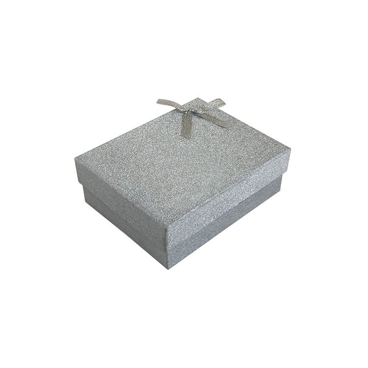
Glitter gift boxes can look premium or painfully cheap depending on color discipline, finish restraint, board structure, and compliance reality. Here is the blunt buyer-side guide to pairing glitter, matte lamination, metallic foil, holographic film, and soft-touch finishes without wrecking brand trust.
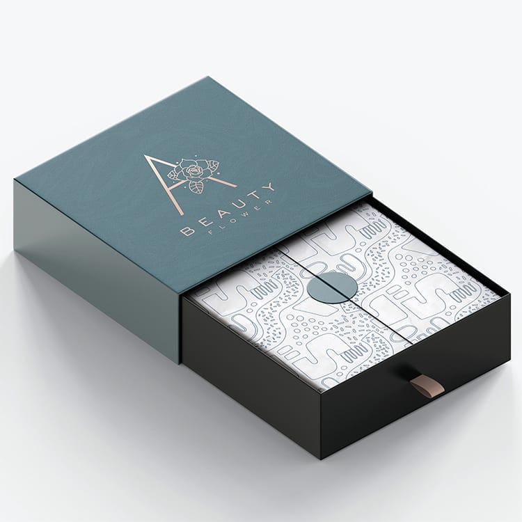
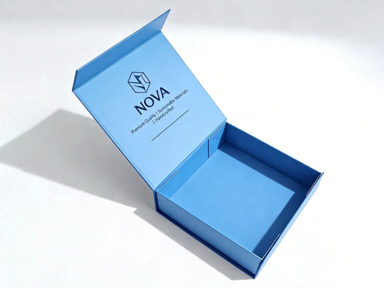
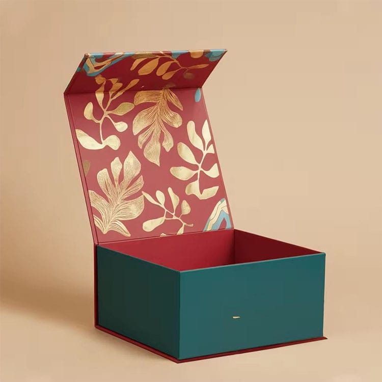
Drawer jewelry boxes usually feel more premium for small, high-value jewelry because the slow reveal matches the product scale. Magnetic jewelry boxes win when the item is larger, layered, or sold as a gift set. The wrong choice, though, makes luxury packaging feel fake.
Shelf impact is not decoration. It is a fight for milliseconds. This article breaks down the luxury packaging finishes that actually sell, the ones that quietly damage margin, and the compliance traps beauty brands keep pretending will not matter.
Folding cartons look simple until you price labor, breakage, and compliance risk into the dieline. This is the blunt guide to tuck ends, auto-lock bottoms, and what they really do on a packing line.
If your perfume box color drifts, customers notice before QC does. I’ll show the Pantone-and-proofing workflow that stops “close enough” from becoming expensive.
Kraft looks “natural” until your brand blue turns swampy and your fine type fills in. This post shows how we actually keep print sharp on brown stock—process, inks, underbases, and proof discipline.
Premium chocolate gift boxes live or die by what nobody posts on Instagram: the insert. I’m going to show you how tray layout and portion protection reduce damage, waste, and compliance risk—using real 2023–2024 data.
Premium doesn’t have to mean “trash by design,” but most beauty packaging still is. Here’s the material truth, the legal risk, and the spec-level moves that keep recyclable materials looking expensive.
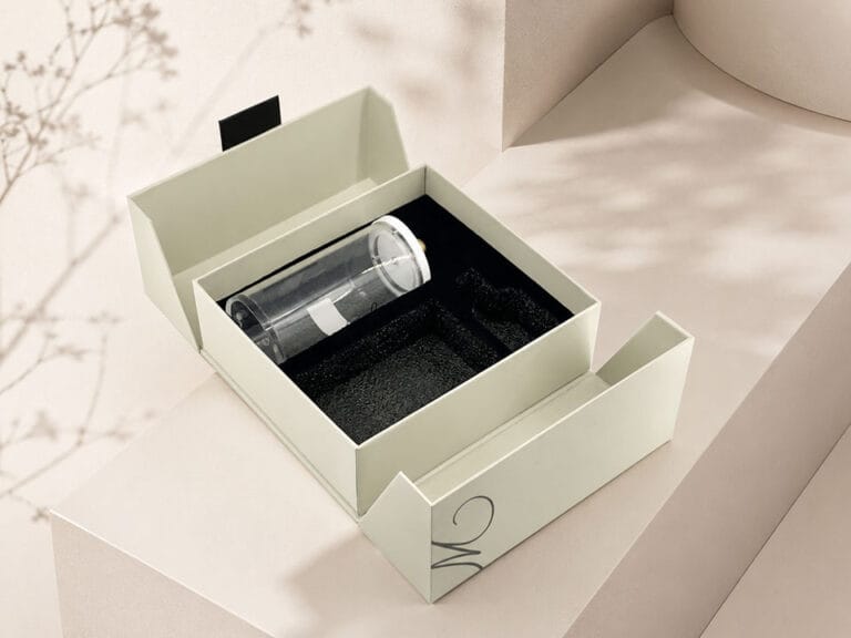
Luxury perfume packaging is mostly stagecraft until the first drop test. I’ll show you how to get the look and real protection without paying for nonsense.