Talk To Our Boss If You Didn't Find The Solution
Our boss, Alanna will ask our team to find out the solution very soon! You must be satisfied with our services!


Color lies, always.
In real packaging runs—especially fragrance—your “perfect” Pantone can swing because the substrate whiteness shifted a hair, the laminator warmed up differently, the press operator matched under the wrong light, or the proof you approved never actually simulated the final ink+finish stack (CMYK+spot+foil+varnish) you’re shipping.
Still think it’s “just printing”?
I’m going to say the quiet part out loud: most perfume packaging color problems are workflow problems pretending to be ink problems. And luxury brands keep paying for the same mistake—approving vibes instead of approving standards.
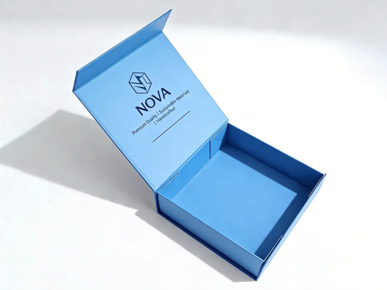
Perfume is a trust product. The customer can’t “test” it on shelf. They judge the box. And that’s why color consistency in perfume packaging is not a nice-to-have—it’s your first fraud filter, your first quality signal, your first brand memory hook.
You want a hard, uncomfortable example of how far this goes? Color gets litigated.
In a U.S. federal trademark dispute, the court record shows teams specifying and checking product color against Pantone reference books and Pantone numbers (not poetic descriptors), and Pantone designations show up repeatedly as evidence of “what the color is” and whether it changed. That’s not theory; that’s an actual paper trail with Pantone codes sitting inside a 2024 court document.
Now zoom back to perfume boxes. Your colors may not be a registered mark today. But if you’re building a luxury line, you’re behaving like they are.
Here’s the trap: a designer picks a Pantone color, everyone nods, and then the real world starts:
And then the brand team wonders why perfume packaging color matching looks inconsistent by region.
If you want Pantone color consistency across vendors, you need a proofing workflow that’s boring, measurable, and enforceable.
I’m going to lay this out like a shop-floor SOP, because that’s the point.
If you skip the substrate/finish definition, you’re not defining a color. You’re defining an argument.
This is prepress proofing for packaging—the part everyone rushes, then regrets.
If you need a packaging-side reference for sampling and proof choices, Zhibang’s breakdown of when to use white samples, digital proofs, or full printed prototypes is a practical baseline: sampling strategy for proofs vs prototypes
This is where most brands get cheap and then get punished.
ISO guidance is blunt about the role of ISO 12647-7 “contract proofs”: they exist to simulate a defined printing condition and function as part of the customer–printer contract.
Translation: if you’re not contract-proofing, you’re negotiating with your future self.
Zhibang also has a speed-vs-risk take that’s worth reading if your team keeps compressing timelines: packaging proofing time tradeoffs
I’m opinionated here: no light booth, no approval. Period.
If you want a factory-side explanation that doesn’t sugarcoat it, their post on preventing printing chromatic aberration gets into standard light, calibration, and ΔE tracking: avoid printing color shifts and chromatic aberration
This is packaging color proofing with teeth: numbers + conditions + sign-off rules.
Foil, emboss, spot UV, matte/soft-touch, metallized paper—these can make two prints from the same press look like different SKUs.
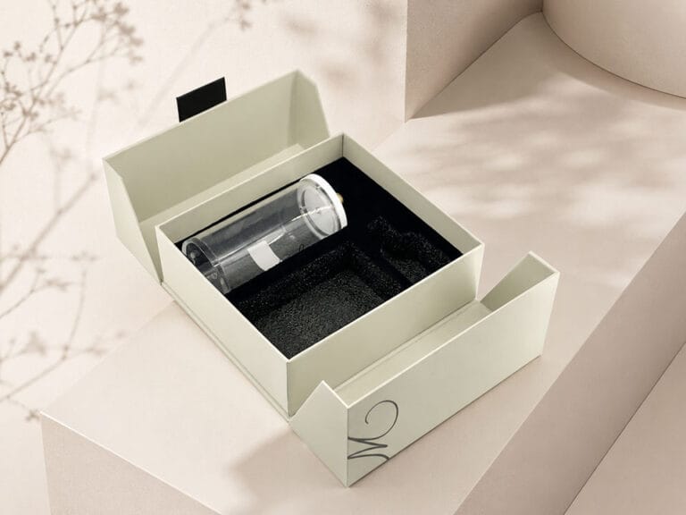
If your perfume bottle is fragile (and most are), you’re already doing structural diligence; extend that mindset to color. Here’s their engineering-side piece: perfume packaging engineering for fragile bottles
Counterfeits love weak packaging discipline. They thrive in the gray zone where “close enough” passes. And the economics are not small.
EUIPO estimates that, on average (2018–2021), cosmetics sales lost to counterfeiting in the EU internal market were 4.8%, about EUR 3 billion, and the report explicitly includes “manufacture of perfumes and toilet preparations” in its sector definition.
Do I think color consistency alone stops counterfeits? No. But sloppy color control is basically an invitation—especially when your real boxes look inconsistent across batches.
| Proof Type | What It Catches | What It Misses | Typical Use in print proofing workflow |
|---|---|---|---|
| Digital proof / E-proof (PDF proof) | Dieline errors, text/placement, barcode quiet zones | Real color, substrate + finish behavior | Early prepress proofing for packaging |
| Contract proof (ISO-style) | Predictive color vs defined condition; spot simulation (within limits) | Some finish effects; exact press quirks | Color sign-off for Pantone color matching for packaging |
| Wet proof / Drawdown | Ink hue on a specific stock | Press dynamics, trapping, dot gain | Spot color approval on target substrate |
| Press proof / Press check | Real press outcome | Costs time; still can change post-finishing | Final validation for critical launches |
| Full printed prototype | Full stack reality: print + finish + assembly | Slow, expensive | High-risk SKUs, hero products, investor launches |
If you want “best Pantone proofing workflow,” it’s not a single proof type. It’s sequencing: e-proof → contract proof → substrate drawdown (when needed) → press sign-off for hero SKUs → post-finish verification.
Color consistency in perfume packaging is the repeatable ability to hit the same visual and measured color target across print runs, vendors, substrates, and finishes by locking a defined Pantone/ICC target, approving via contract proof under standard viewing (e.g., D50), and enforcing ΔE tolerances at proof, press, and post-finish checkpoints.
After that definition, the rest is discipline: one target, one viewing condition, one approval rule, and measurement that survives lamination and varnish.
A print proofing workflow is the ordered approval system that converts design intent into print reality by moving from file preflight (PDF/X, spot naming) to predictive proofs (contract proof) to physical validation (drawdowns/press proofs) with documented tolerances, viewing conditions, and sign-offs that bind both brand and printer to the same color outcome.
If the workflow doesn’t end with a measurable acceptance rule, it’s not a workflow—it’s a hope.
ISO 12647-7 is the standard that defines requirements and test methods for producing hardcopy digital proofs (“contract proofs”) that simulate a defined printing condition using characterization data and color management, making the proof a contract-grade reference between customer and printer rather than an informal visual guess.
It matters because it reduces the “but our press…” excuses by anchoring approval to a known target.
Lamination and spot UV affect Pantone color matching by changing light scatter, gloss, and perceived saturation, which shifts measured Lab values and human perception even when the ink drawdown is identical, meaning a Pantone match approved pre-finish can miss post-finish unless the finish stack is part of the defined target and verification.*
If your workflow signs off before finishing, you’re approving the wrong product.
Treating brand color as “close enough” creates measurable exposure because color is used as a commercial identifier in packaging and advertising, and records show Pantone numbers and reference books being used to specify, check, and argue over product color in formal disputes, turning sloppy color control into evidence.
Even if you never see a courtroom, you’ll see returns, reprints, and brand dilution.
If you’re tired of perfume packaging color matching that drifts by batch, do this next: build a one-page “Color Control Spec” (Pantone code + substrate + finish + viewing + ΔE tolerance + proof type) and enforce it across suppliers. And if you want a real-world packaging partner perspective, browse Zhibang’s customer cases for luxury boxes and then bring your current proofing chain—screenshots included. I’ll tell you where the workflow is leaking.