Talk To Our Boss If You Didn't Find The Solution
Our boss, Alanna will ask our team to find out the solution very soon! You must be satisfied with our services!


Shelf impact sells.
And in luxury cosmetic packaging, that impact is not created by adding every finish your supplier can quote; it is created by controlling contrast, texture, light reflection, edge quality, and the tiny moment when a buyer decides whether a cream, serum, fragrance, or lipstick feels worth the price before they even read the INCI list.
So why do so many brands still treat finishes like decoration?
I’ll be blunt. The beauty industry has a packaging addiction, and not the elegant kind. Too many founders ask for foil, embossing, debossing, spot UV, holographic film, soft-touch lamination, magnetic closures, and “eco-friendly” claims in one breath. That is not luxury. That is panic with a Pantone book.
The smarter route is harder: choose fewer finishes, engineer them better, and make every surface earn its cost.
The market is not small either. According to ResearchAndMarkets data distributed by Business Wire, the global cosmetics packaging market was estimated at US$47.3 billion in 2024, up from US$45.2 billion in 2023, with Asia-Pacific holding 44.3% share. Plastic still dominated at 64.5% of cosmetic packaging material use in 2024, while paper and paperboard were forecast as one of the faster-growing material segments. That tells us something uncomfortable: premium beauty packaging is still visually driven, but the regulatory bill is arriving.
For brands comparing structures, coatings, and print routes, I would start with Zhibang’s custom cosmetic boxes because it sits close to the core use case here: beauty packaging with precise color, premium coatings, and protective retail-ready structures.
A finish alone does not create luxury. A system does.
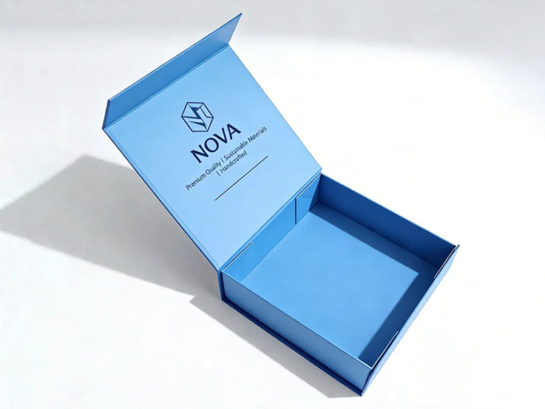
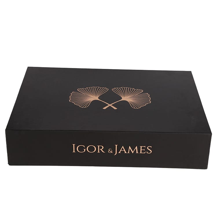
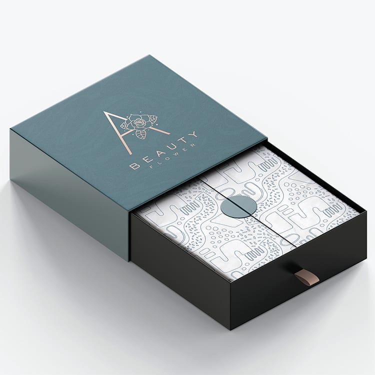
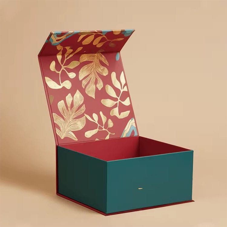
Luxury cosmetic packaging works when substrate, print method, coating, tactile relief, metallic detail, and opening ritual reinforce the same brand signal. A matte black rigid box with blind embossing says “clinical prestige.” A pearl paperboard carton with rose-gold foil says “soft feminine giftability.” A holographic drawer box says “TikTok launch energy.” Same category. Different buyer psychology.
But here is the hard truth: shelf impact is usually won by contrast, not excess.
Foil stamping cosmetic packaging works because metal reacts to retail light. Gold, silver, champagne, copper, gunmetal, holographic, and pigment foils create movement while the carton sits still. That matters under Sephora-style lighting, department-store glass, duty-free shelving, and pharmacy endcaps.
But foil is not a permission slip to shout.
Use it on the logo, monogram, thin border, edition mark, or one hero ingredient cue. Keep it tight. One or two foil zones usually feel more expensive than a full metallic crime scene.
I like hot foil stamping on:
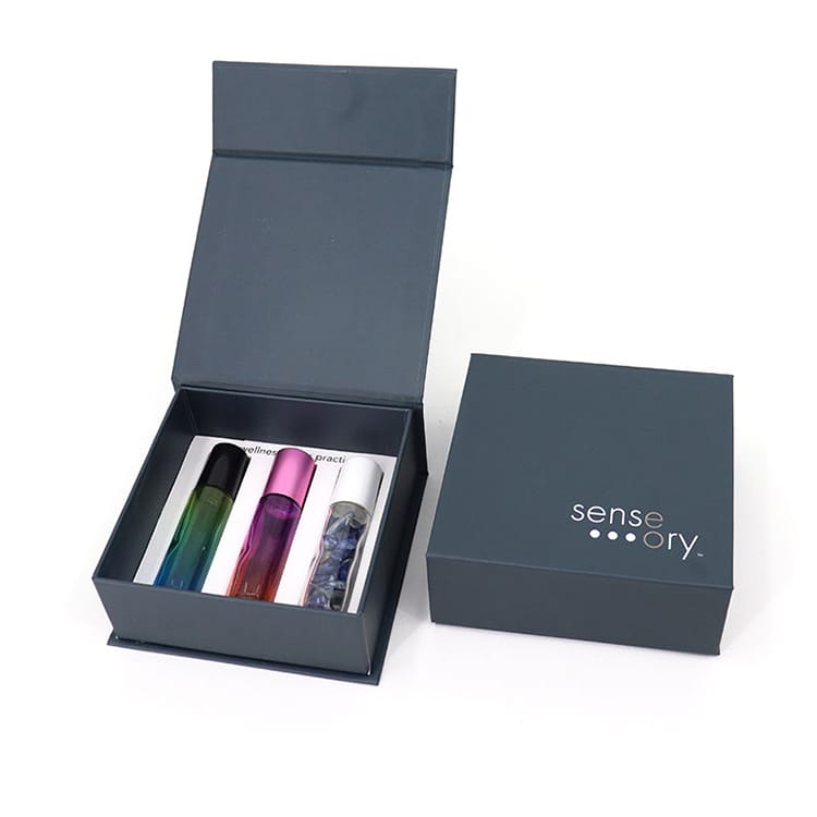
For a practical example of how foil and matte finishing can work inside a fragrance structure, Zhibang’s luxury rigid gift box for perfume and fragrance packaging shows the classic formula: rigid board, art paper wrap, hot foil stamping, matte lamination, and compact proportions.
Embossing cosmetic packaging raises selected details above the surface. Debossing presses them inward. Blind embossing uses no ink or foil, which is why it often looks more expensive than “more expensive” decoration.
The reason is simple. Fingers believe texture faster than eyes believe claims.
I have seen brands waste budget on oversized foil logos when a quiet debossed mark on soft-touch black stock would have done more for perceived value. Embossing is not just visual. It slows the hand. It creates friction. It makes the object feel owned before it is purchased.
Use embossing for:
But use embossing carefully on folding cartons. Heavy relief can crack ink, distort fine type, or create register issues when paired with foil. On rigid boxes, you get more forgiveness, especially with thicker wraps and larger surface areas.
Below is the blunt version. Not every premium finish deserves your money.
| Finish | Best Use Case | Shelf Impact | Cost Pressure | Risk | My Opinion |
|---|---|---|---|---|---|
| Hot foil stamping | Logos, borders, edition marks | Very high | Medium to high | Can look cheap if overused | Best ROI when used with restraint |
| Blind embossing | Luxury logos, patterns, tactile cues | Medium-high | Medium | Low visibility in bad lighting | Underrated and often more tasteful than foil |
| Soft-touch lamination | Skincare, fragrance, premium gift boxes | High in-hand impact | Medium | Scuffing, fingerprints on dark colors | Powerful, but test durability |
| Spot UV | Logos, droplets, ingredient graphics | High contrast | Medium | Registration issues, tacky shine | Excellent over matte fields |
| Matte lamination | Minimal luxury, clean beauty, clinical brands | Medium | Low-medium | Can flatten color | Safe, mature, reliable |
| Gloss lamination | Mass beauty, vivid color cosmetics | High color pop | Low-medium | Less “quiet luxury” | Better for bold retail than prestige understatement |
| Holographic film/paper | Gen Z, limited drops, PR kits | Very high | Medium-high | Fast trend decay | Use for campaigns, not permanent identity |
| Textured paper | Artisan, natural, spa, niche fragrance | Medium-high | Medium | Color inconsistency | Feels credible when sustainability claims are modest |
For deeper cost logic, Zhibang’s article on high-end cosmetic box printing versus standard printing is worth using as a supporting internal read because it separates offset, digital, foil, embossing, spot UV, and color-control decisions instead of treating “premium” as one vague upgrade.
Soft-touch cosmetic packaging is dangerous.
Not because it is bad. Because it feels so good that teams stop asking practical questions. A soft-touch surface can make a US$28 serum feel like US$68, especially on rigid board, black paper, deep navy, warm ivory, or muted cosmetic neutrals. It gives that peach-skin, powdery, almost ceramic handfeel that luxury skincare brands love.
But the finish has enemies: oil, abrasion, fingernails, shipping rub, warehouse dust, and dark-color scuffing.
I would never approve a soft-touch production run without rub testing, scratch testing, and real transit simulation. Not a pretty desk sample. A punished sample. Put it in a shipper, move it around, let people handle it with lotion on their hands, then check the corners.
Zhibang’s red rigid gift box with soft-touch finishing is relevant here because the page breaks down matte/gloss lamination, anti-scratch lamination, soft-touch/silk lamination, AQ coating, UV coating, varnish, spot gloss UV, and raised digital effects in a way that maps directly to cosmetic box finishing techniques.
My rule is simple: if the pack will live in clean retail, soft-touch can be beautiful. If it will survive e-commerce abuse, dark cartons, fulfillment centers, and influencer mailers, upgrade the protection or choose another finish.
Spot UV works because it creates contrast on command. Matte field, glossy logo. Soft-touch background, raised droplet pattern. Dark carton, high-gloss ingredient mark. Done properly, it gives premium beauty packaging a controlled flash without the heavy symbolism of foil.
It also photographs well. That matters more than some packaging veterans admit.
A raised UV serum droplet on a skincare carton can signal hydration faster than copy. A gloss botanical line over matte cream stock can say “active but natural.” A high-build clear logo on black can feel almost architectural.
But spot UV has a technical problem: registration. If the artwork, die line, print pass, and coating pass are not aligned, luxury becomes sloppy in one millimeter. And luxury buyers notice one millimeter.
For short-run launches, Scodix-style digital enhancement can be useful because it can create raised gloss, texture, and digital foil without traditional tooling. For bigger runs, conventional spot UV still has strong economics, but only when prepress is disciplined.
Here is where beauty brands need to sober up.
The European Commission says all packaging must be recyclable by 2030 under the Packaging and Packaging Waste Regulation direction, and Reuters reported in April 2024 that EU annual packaging waste grew about 25% from 2009 to 2021, reaching 84 million tonnes. That is not a branding trend. That is a procurement constraint with a date attached.
The U.S. is not a free-for-all either. The FTC’s Green Guides are designed to help marketers avoid environmental claims that mislead consumers. Translation: “eco,” “green,” “recyclable,” “biodegradable,” and “sustainable” are not mood words. They are claims that need substantiation.
And the waste numbers are ugly. The U.S. EPA reports that containers and packaging made up 82.2 million tons of municipal solid waste generation in 2018, or 28.1% of total generation. It also estimated that plastic containers and packaging had a 13.6% recycling rate in 2018, while paper and paperboard packaging had an 80.9% recycling rate. Yes, those are older EPA base figures, but they remain widely used because the agency’s packaging dataset still points to 2018 as the comprehensive reference.
This is why I like recyclable luxury paperboard systems when they are engineered honestly. Not fake “green luxury.” Real design discipline: fewer mixed materials, no unnecessary magnets, no metallized film where foil transfer would do, no black plastic components that sorting systems hate, no vague claims.
For brands trying to keep prestige without creating a recycling mess, Zhibang’s guide to sustainable cosmetic packaging that still looks premium fits naturally into the buying journey.
The large groups are already moving. Smaller brands should pay attention, not imitate blindly.
Estée Lauder Companies reported that in fiscal 2024, 71% of its packaging by weight was recyclable, refillable, reusable, recycled, or recoverable, moving toward its 2025 target of 75% to 100%. L’Oréal states in its 2024 Universal Registration Document that its packaging policy applies “reduce, replace and recycle” principles, including smaller and lighter packaging, recycled or low-carbon materials, and compatibility with recycling circuits through its circular packaging policy.
That is the signal. Premium packaging is no longer just about “more.” It is about controlled material intelligence.
And look at deal flow. In April 2024, Reuters reported that LVMH-backed L Catterton agreed to buy a majority stake in KIKO Milano in a deal valued around €1.4 billion, or US$1.5 billion, including debt. Why mention KIKO in an article about packaging finishes? Because accessible beauty with strong retail identity is valuable. Shelf impact is not reserved for ultra-luxury. It is a valuation language.
If a founder asked me what to choose for luxury cosmetic packaging, I would not start with finishes. I would ask about price point, retail channel, shipping route, formula risk, target market, reorder volume, and disposal claim.
Then I would build one of these stacks.
Use rigid or high-GSM folding carton, muted Pantone spot color, matte or soft-touch lamination, blind embossing, and tiny foil detail. Keep copy minimal. Let negative space do the expensive work.
Best for: serums, creams, eye care, ampoules, clinical-luxury lines.
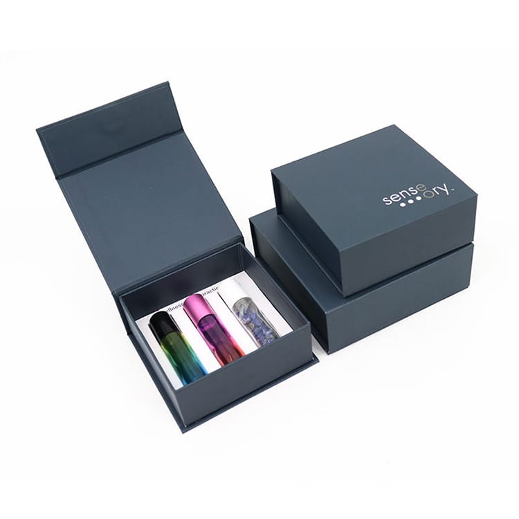
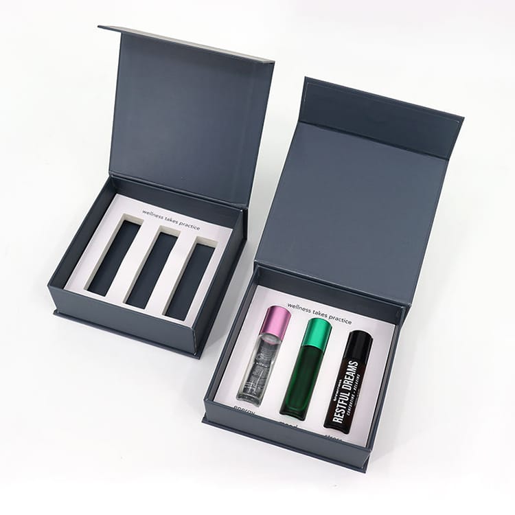
Use rigid board, textured or art paper wrap, foil-stamped logo, debossed pattern, satin ribbon or drawer reveal, and precise insert engineering. Perfume is ritual. The structure should slow the opening.
Best for: eau de parfum, discovery sets, gift boxes, limited releases.
For fragrance-specific formats, Zhibang’s perfume packaging design guidance is a useful internal support link because fragrance packaging has a different job: it must look expensive and protect glass.
Use high-color offset or UV print, gloss accents, spot UV, selective foil, and sharper contrast. Color cosmetics can tolerate more visual energy than skincare, especially for seasonal drops.
Best for: lipstick, eyeshadow, blush, mascara kits, influencer collections.
Use uncoated or lightly coated paperboard, soy or vegetable-based inks where suitable, AQ coating, blind debossing, restrained typography, and verified recyclability language. Do not overclaim.
Best for: natural skincare, body care, refill systems, wellness-led beauty brands.
Use holographic paper, metallic effects, drawer structures, raised UV, fluorescent accents, or digital foil. But keep it campaign-specific. Trend finishes age fast.
Zhibang’s holographic rainbow drawer gift box for cosmetic packaging is a good example of a high-impact visual route where offset, UV print, metallic Pantone options, soft-touch lamination, embossing, debossing, and spot UV can be combined for a launch moment.
Luxury packaging finishes fail in predictable ways.
The first failure is overfinishing. A carton with foil, embossing, spot UV, glitter stock, holographic film, and a giant logo usually looks insecure. The second is bad color management. Cosmetic beige is brutal. Warm ivory can turn yellow. Soft pink can shift dirty. Black can go brown, blue, or lifeless depending on substrate and coating.
The third failure is ignoring touch. A luxury pack that looks premium online but feels thin in hand loses the sale at the last second.
The fourth failure is sustainability theater. If your packaging uses mixed materials, permanent adhesives, decorative films, plastic windows, magnets, and a vague recyclable claim, you are not building future-proof packaging. You are building a liability with nice lighting.
The fifth failure is not testing under the actual channel. Retail shelf, TikTok unboxing, Amazon-style e-commerce, duty-free travel, boutique display, and subscription box fulfillment all punish packaging differently.
Luxury cosmetic packaging is premium beauty packaging designed to increase perceived product value through structure, material, finish, tactility, and brand storytelling while protecting the product through retail, shipping, and handling. It often uses rigid board, specialty paper, foil stamping, embossing, soft-touch coatings, spot UV, precise color control, and engineered inserts.
In plain English, luxury packaging makes the buyer feel the price is justified before the product is opened. The best versions are not always the loudest; they are the most controlled, consistent, and satisfying to hold.
The strongest cosmetic packaging finishes for shelf impact are hot foil stamping, embossing or debossing, soft-touch lamination, spot UV, raised UV, matte lamination, metallic papers, textured papers, and holographic effects when used selectively. These finishes work because they manipulate light, touch, contrast, and perceived craftsmanship within seconds.
For most brands, I would prioritize foil plus matte contrast, blind embossing, and controlled spot UV before chasing exotic finishes. Shelf impact comes from hierarchy. The buyer’s eye needs a focal point, not a shouting match.
Foil stamping is worth the cost for cosmetic boxes when it is used on high-value visual elements such as logos, borders, edition marks, or small premium accents. It adds metallic reflection, improves retail visibility, and can increase perceived value without changing the full packaging structure.
But foil becomes wasteful when it covers too much area or fights with busy artwork. The best foil stamping cosmetic packaging usually uses less foil than clients first request.
Embossing raises a design above the packaging surface, while debossing presses the design into the surface to create a recessed tactile effect. Both techniques add texture, depth, and premium feel, especially on logos, patterns, monograms, and minimalist beauty packaging designs.
Embossing feels more visible and decorative. Debossing often feels quieter and more architectural. For luxury skincare, I usually prefer blind debossing or fine embossing over large shiny effects.
Soft-touch lamination is good for luxury cosmetic packaging when the brand wants a velvety, premium, skin-like feel that improves in-hand perception. It works especially well on skincare, fragrance, and gift boxes, but it must be tested for scuffing, fingerprints, abrasion, and shipping damage before production.
Soft-touch is seductive, but it is not magic. Dark colors need anti-scratch protection. E-commerce packs need tougher testing. Retail-only packs have more freedom.
Sustainable cosmetic packaging can still look premium by using recyclable paperboard, mono-material structures, verified PCR content, textured papers, precise printing, blind embossing, AQ coating, restrained foil transfer, and right-sized rigid or folding carton formats. The goal is to build luxury through craft, proportion, and touch rather than unnecessary mixed materials.
The best sustainable luxury packaging avoids lazy green signals. Brown kraft alone does not equal sustainability. A clean recyclable structure with elegant finishing usually beats a complicated “eco” pack that cannot be sorted.
The best finish combination for luxury skincare packaging is usually matte or soft-touch lamination, blind embossing or debossing, a small foil-stamped logo, and tightly controlled Pantone color on rigid board or premium folding carton stock. This combination creates tactile value, visual restraint, and strong shelf identity.
For clinical skincare, reduce shine. For spa skincare, add texture. For science-led brands, keep geometry clean and let one detail carry the premium signal.
Luxury cosmetic packaging is not about adding finishes. It is about making the buyer believe the formula, price, and brand promise before the lid opens.
So choose the finish stack with discipline. Test it under retail light. Rub it. Scratch it. Ship it. Photograph it. Check the recyclability claim before the artwork goes final. And please, stop calling every shiny surface luxury.
If you are preparing a skincare, fragrance, makeup, or gift-set launch and need packaging that balances shelf impact with real production logic, start by reviewing Zhibang’s custom cosmetic boxes and request a quote with your product dimensions, target market, quantity, finish preferences, and sustainability requirements. Your packaging should not merely look premium in a PDF mockup. It should survive the shelf.