Talk To Our Boss If You Didn't Find The Solution
Our boss, Alanna will ask our team to find out the solution very soon! You must be satisfied with our services!


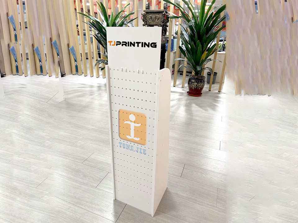
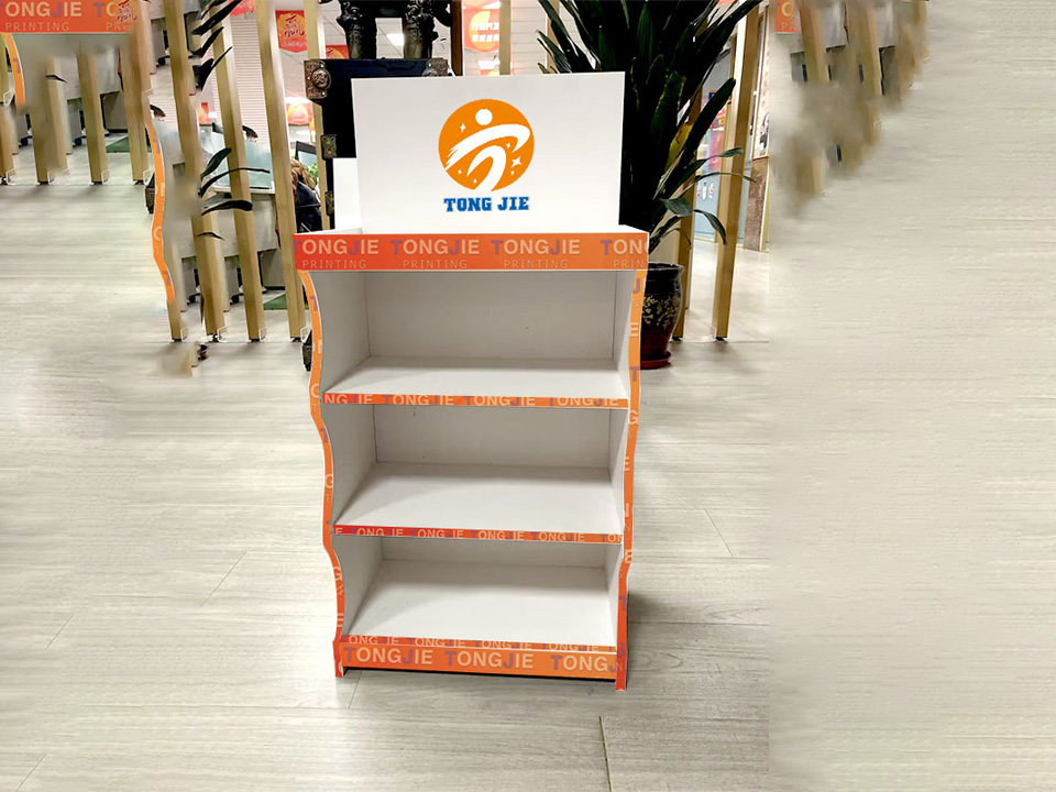
Countertop displays look small, but they sit in the most expensive real estate in your store: the checkout. When you design them well, they push impulse buys, tell your brand story, and make replenishment easy for the team behind the counter.
This guide walks you through structure, product choices, visuals, and real retail scenarios you can plug straight into your next rollout.
A countertop unit lives in the “impulse zone.” Its job is simple:
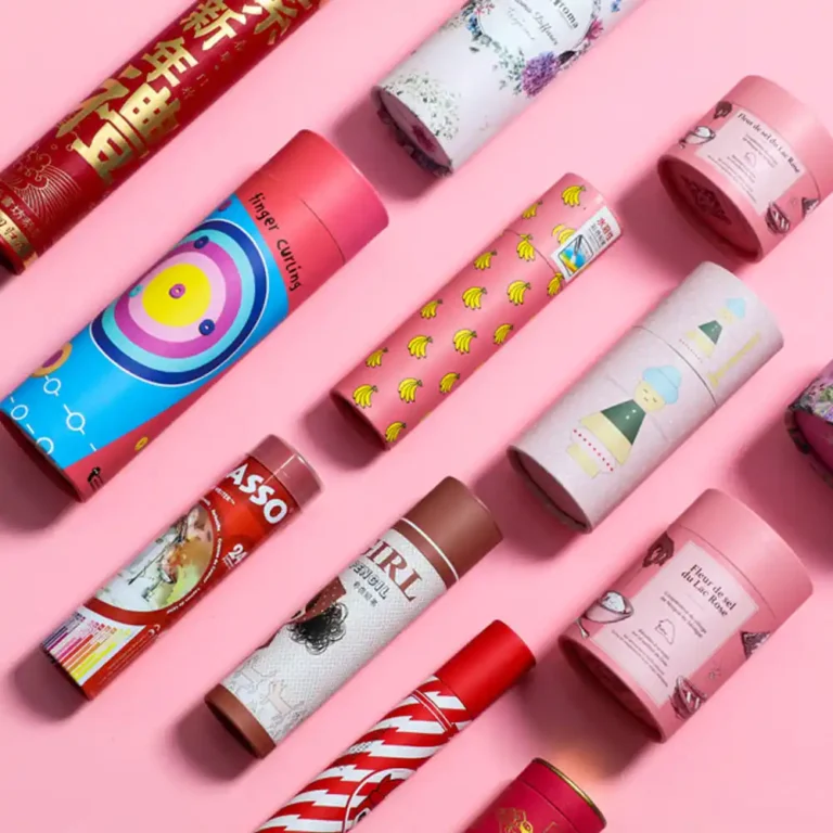
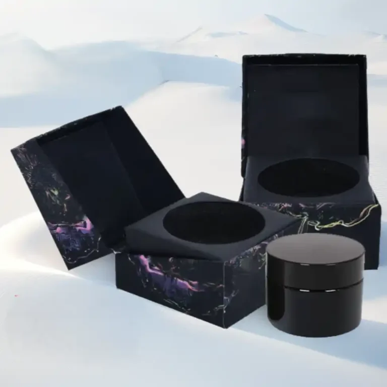
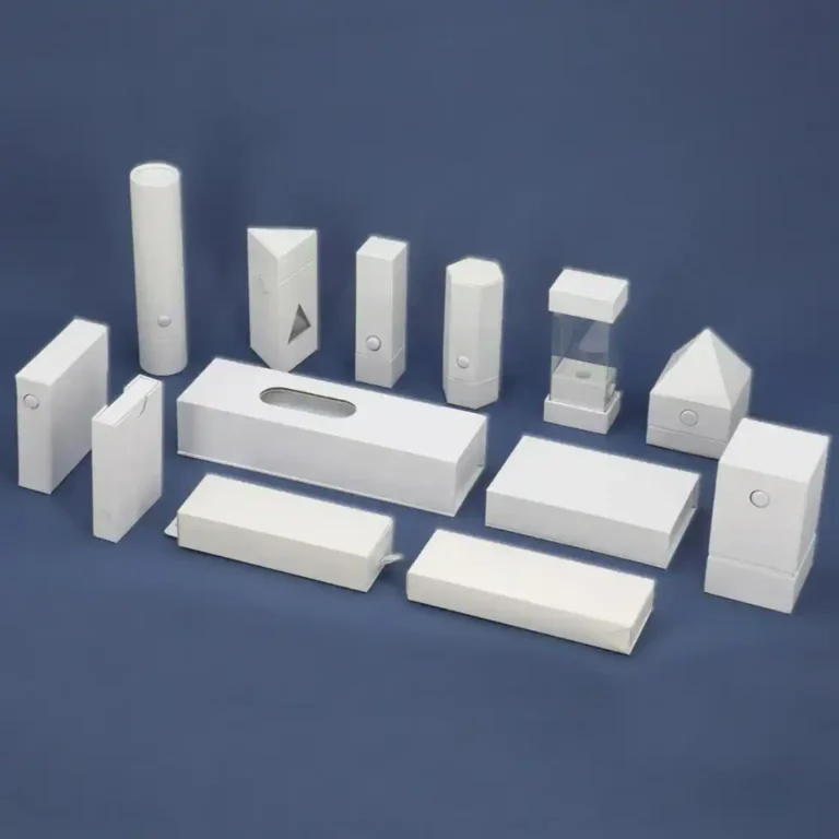
Think about mini skincare kits, sample paper tube packs, pre-rolls, or small gift items. For beauty brands, a custom cosmetic cardboard counter display box for retail works well for lip balms, sheet masks, or mini serums. For vape or cannabis brands, a compact PDQ cardboard vape counter retail display stand box keeps SKUs neat and compliant.
The countertop unit also acts as a mini billboard. It should:
If your main range sits in paper gift boxes or paper tube packaging, the graphics and finishes on the display should match. This helps shoppers connect the counter stock with what they saw in the aisle or online.
Not every SKU belongs near the till. Countertop displays work best with:
For cross-border sellers, wholesalers, and brand owners, this is a classic “basket top-up” move. You use the last step of the journey to add a bit more margin without slowing the queue.
You can treat the counter as a small planogram. Instead of throwing many SKUs into one tray, think in “stories”:
Here’s a simple way to map scenarios to display types.
| Retail scenario | Recommended products | Display structure example | Merchandising note |
|---|---|---|---|
| Beauty or skincare checkout | Mini creams, lip balms, travel kits | Branded cosmetic counter PDQ | Push trial and repeat purchase |
| Vape or cannabis store counter | Pre-rolls, cartridges, accessories | Printed PDQ counter stand for vape or pre-rolls | Keep compliant, tidy, and easy to restock |
| Gourmet food or coffee shop | Mini coffee tubes, cocoa, snacks | Small PDQ tray plus header card, linked to main floor cardboard displays | Encourage impulse gifting and self-treat |
| Multi-brand supermarket or pharmacy | Seasonal promo items and samples | Standardized counter units plus floor stands for campaigns | Make it easy for staff to swap in new SKUs |
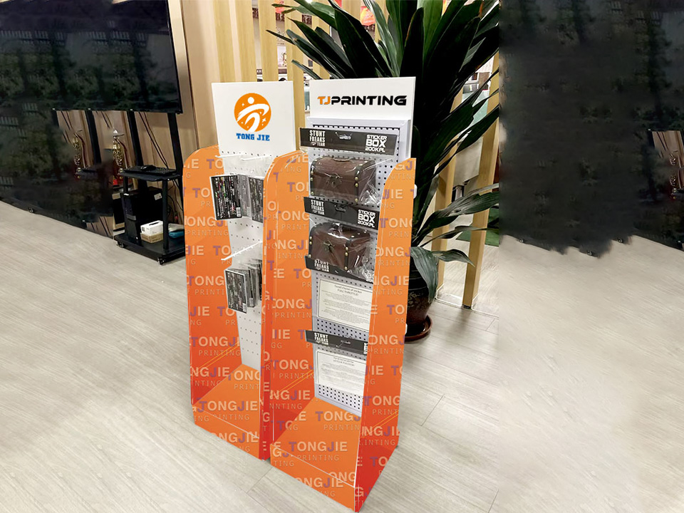
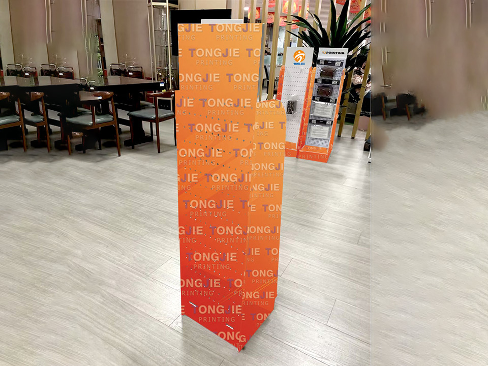
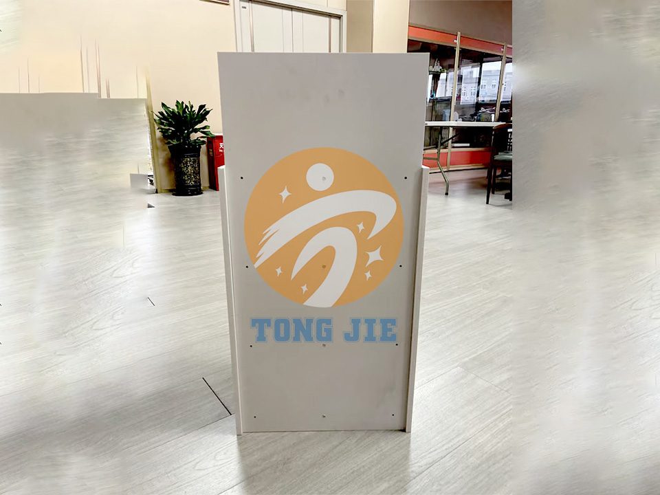
Large rollouts often pair these countertop units with a matching custom corrugated cardboard retail floor display stand rack or five-tier cardboard pasta sauce retail floor display stand so the story runs from aisle to cash wrap.
On a busy counter, you have just a second or two. That means clear hierarchy:
You can carry over finishes from your main range. If your brand uses foil, spot UV, or high-end print on your boxes, you can apply the same techniques on the header card or side panels of the display. This keeps your “visual language” tight across all touchpoints.
For clean, retail-ready fixtures:
If you already run a custom 4-tier beverage cardboard floor display stand rack in-store, the countertop graphic style should echo it. Shoppers then see one consistent campaign instead of random pieces.
Even on a counter, facings and reach matter. You want:
Many brands use the aisle to tell the long story with a cardboard displays program, then use the counter to close the sale with simple “take me home now” offers.
Think about how your buyers behave:
The key is to keep the counter clear. If the display blocks the customer’s view of staff, or competes with POS screens, even a well-designed unit will underperform.
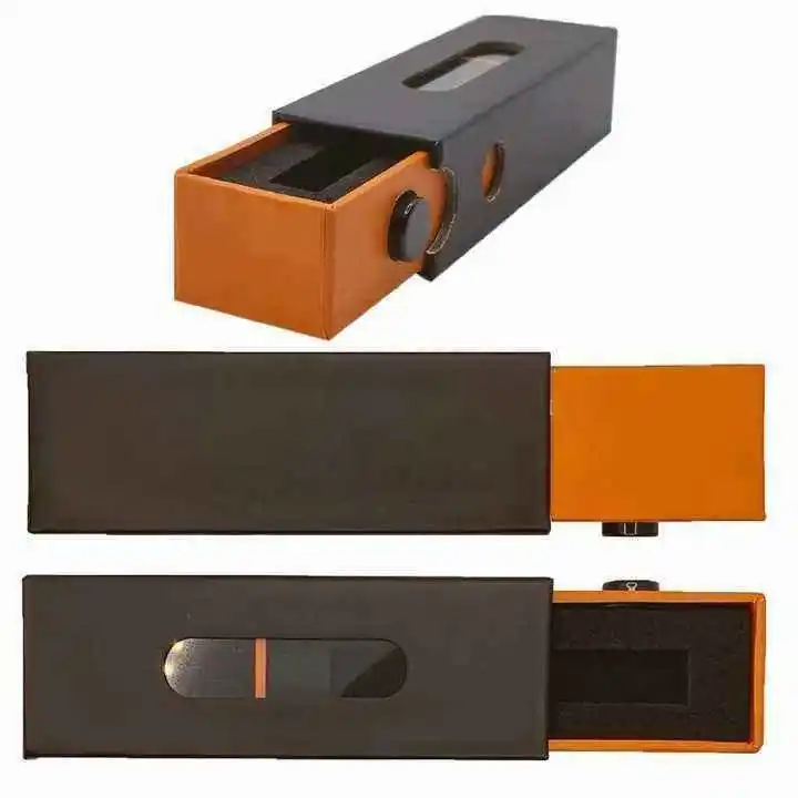
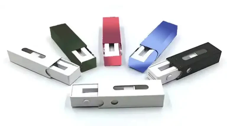
For most brands, cardboard PDQ (Product Display Quantity) units hit the sweet spot between cost, flexibility, and print quality. Typical options:
If you work with food, cosmetics, or gift items, a consistent system that covers both primary packaging and display is easier to manage. Zhibang can align your boxes, tubes, and displays under one spec so your supply chain and your visual team stay in sync.
Real life at store level is messy. Staff are busy, counters are crowded, and nobody has time for a 20-step assembly.
When you brief your project, think about:
For beverage, snack, or pasta brands, we often combine floor and counter units in one logistics plan using solutions like the custom 4-tier beverage cardboard floor display stand rack. The same thinking applies at the counter: keep assembly intuitive, keep restocking fast.
Even strong brands fall into the same traps:
A quick pre-production checklist helps: “Is the story clear? Can staff assemble this quickly? Does it match our main range? Does it feel like us?”
Zhibang Packaging focuses on custom boxes, displays, and full-pack programs for brands, wholesalers, cross-border sellers, and agencies. That means you can handle:
If you’re planning your next campaign, you can explore more ideas on the Zhibang Packaging custom packaging solutions site, from cardboard displays to tubes and gift boxes, then share your product sizes and sales goals. From there, we can help you build countertop displays that fit your brand, your planogram, and your real retail world.