Talk To Our Boss If You Didn't Find The Solution
Our boss, Alanna will ask our team to find out the solution very soon! You must be satisfied with our services!


You can have a great formula and a clean label, then lose the sale because the box feels… meh. Not ugly. Just forgettable. And cosmetics is a feel-first category. People touch the pack, judge it in two seconds, then decide if your brand is “premium” or “budget” before they even read the INCI list.
So let’s keep it real: high-end printing isn’t about flexing. It’s about controlling risk—color drift, scuffing, cheap-looking shine, weak structure, messy seams—so your box matches the price point you’re asking for.
Below, I’ll break down what you actually get when you upgrade, where standard printing is totally fine, and how to choose without overbuilding.
Standard usually means: a folding carton, printed in CMYK, with a basic laminate or varnish, and a structure that’s easy to auto-pack. It’s the workhorse.
If you’re shipping a single SKU, need fast turnaround, or you’re still testing the market, standard is not “low quality.” It’s just less fussy.
Typical standard choices you’ll see in cosmetics:
If your product sits in a simple carton and the experience happens mostly online, a well-designed standard carton can still look sharp—especially if your layout is clean and your typography doesn’t scream.
If you’re building cartons for retail or DTC, start here: Folding Cartons. It’s the core format for a lot of skincare and color cosmetics.
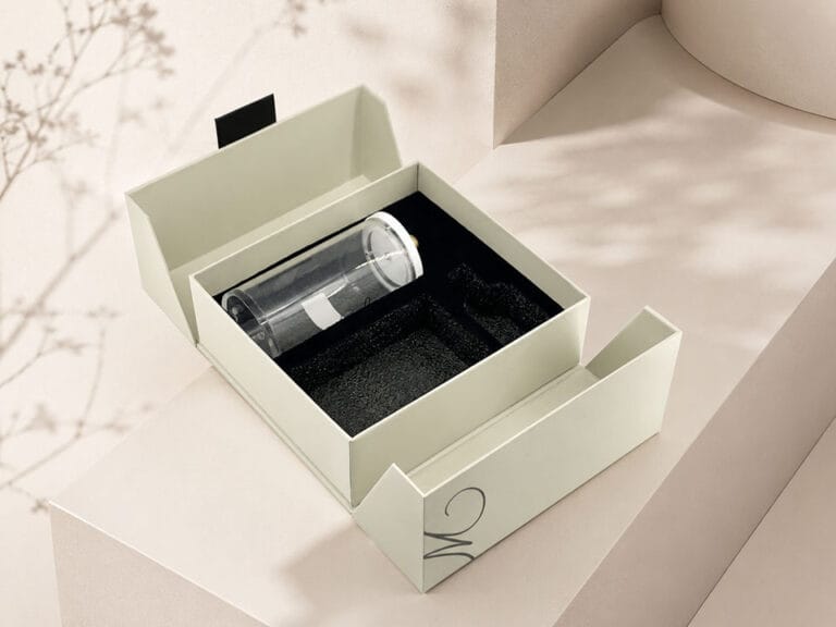
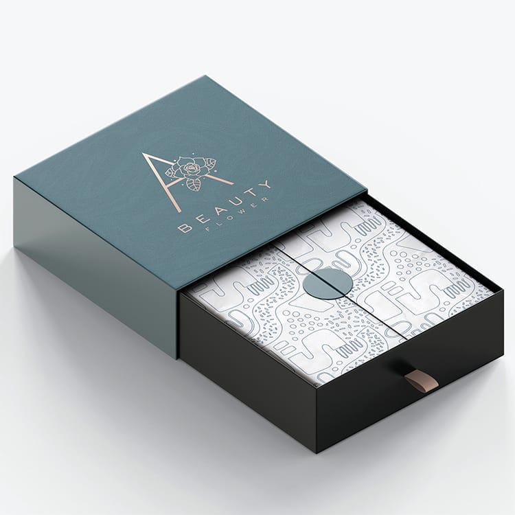
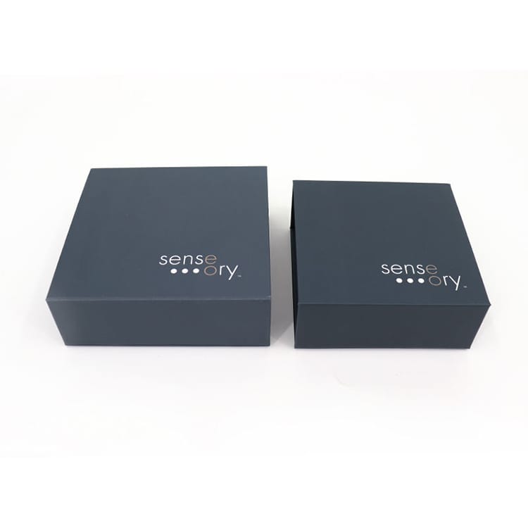
High-end printing usually shows up when brands need a stronger first impression and more “hold it in your hand” credibility. That’s where rigid structures and premium finishes come in.
High-end can mean:
If you want a quick snapshot of premium options made for beauty, start with Custom Cosmetic Boxes. It’s basically the “beauty packaging lane.”
And yes—if you’ve ever opened a magnetic closure box and your brain went “ok this feels expensive,” that’s the point.
Example formats that naturally feel higher-tier:
This is where a lot of brands get confused, so here’s the simple version.
Digital printing shines when:
Offset printing earns its place when:
The catch: offset is less forgiving. If your files, trapping, or spot builds aren’t clean, you’ll see it. That’s why prepress and proofing matters more as you move upscale.
A lot of cosmetic brands do a smart hybrid flow: digital for early drops + offset for scaled production once the artwork is locked.
In beauty, color isn’t decoration. It’s brand identity. If your beige turns pink-ish, or your black looks washed, your whole vibe slips.
Here’s what usually causes “why doesn’t it match” drama:
Industry black-talk you’ll hear in this zone:
If you’re serious about repeatability, work with a manufacturer that can run design + production in one pipeline, so you’re not playing telephone.
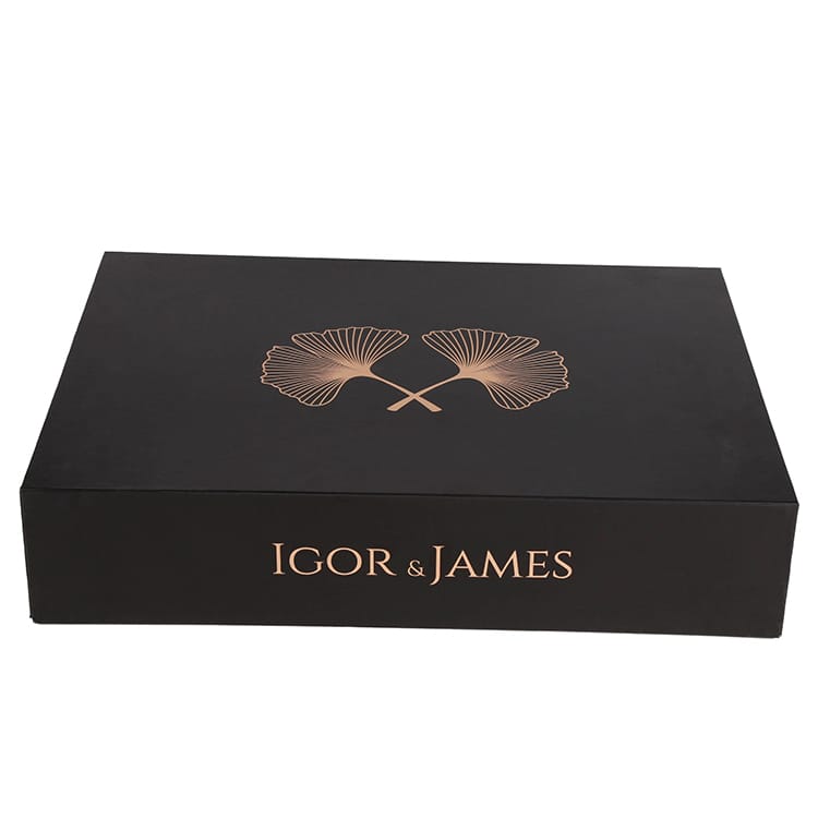
Foil is not “extra sparkle.” It’s a signal.
Use foil when you want:
But foil can also look tacky if you overdo it. Keep it tight. One or two foil zones. Let whitespace do its job.
Real product example: a folding cosmetic carton with foil logo feels immediately upgraded without changing the whole structure. See: Custom Printed Red Duplex Folding Cosmetic Packaging Box.
Emboss/deboss is the “you feel it before you read it” tool.
It helps when:
It also pairs great with foil. Foil gives light. Emboss gives depth. Together, they’re loud without shouting.
Spot UV is basically controlled shine. It works when you use it to create hierarchy:
But don’t slap spot UV everywhere. That’s where packaging starts looking like a nightclub flyer. Use contrast with intention.
Soft-touch feels expensive… until it arrives scuffed and looks dirty. That’s the part brands don’t talk about enough.
If you sell DTC, your box goes through:
So when you choose soft-touch, also talk about:
If your customer sees fingerprints and scratches first, your premium upgrade backfires.
A luxury cosmetic box that arrives crushed is painful. Like, physically painful.
That’s why a lot of brands pair premium inner packaging with a strong outer shipper:
For shipping-focused packaging, look at Printed Corrugated Boxes. This is where you protect the experience.
And if your brand does subscription drops or heavy bundles, corrugated isn’t “less premium.” It’s just the right tool for the job.
| Upgrade element (keyword) | What it fixes | What it adds | When it’s worth it | Common mistake |
|---|---|---|---|---|
| Rigid gift box | flimsy feel, weak structure | premium weight + presentation | gift sets, high AOV, retail display | overbuilding for a low-price item |
| Magnetic closure | awkward opening | “snap” luxury moment | PR kits, launches, influencer seeding | weak magnet strength + bad alignment |
| Offset printing | inconsistent color at scale | sharper detail + steadier repeats | stable SKUs, long-term reorders | skipping proof discipline |
| Digital printing | slow iteration | quick versions + short runs | testing, limited runs, many SKUs | expecting perfect match across substrates |
| Hot foil stamping | flat logo, low shelf pop | premium highlight | minimalist design, strong logo | foiling too much area |
| Emboss/deboss | forgettable surface | tactile memory | subtle branding, matte packs | embossing thin lines that collapse |
| Spot UV | no hierarchy | contrast + focus | highlight patterns/logo | using it everywhere |
| Soft-touch + anti-scuff | cheap handfeel | luxury touch | skincare, premium sets | picking soft-touch without scuff plan |
| Corrugated shipper | damage + returns | protection + clean unboxing | DTC, glass, bundles | using weak flute / no inserts |
No cost math here, because honestly it depends on run size, structure, finishes, and how picky your brand standards are. But this table tells you what you’re buying: less risk, more perception, better delivery.
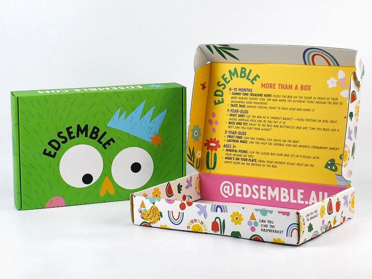
If you’re doing a product drop and content is the fuel, you want a pack that photographs well and feels good on hand.
A common combo:
If your drop includes a bundle, a flat-pack rigid option can be a lifesaver for storage and packing speed: Collapsible Gift Boxes.
Retail is brutal. Too much text kills you. Too many finishes also kills you. You need hierarchy, clean branding, and one premium cue.
A good reference for layout logic is this: Designing Eye-Catching Folding Cartons. It talks about information order in a way your team can actually follow.
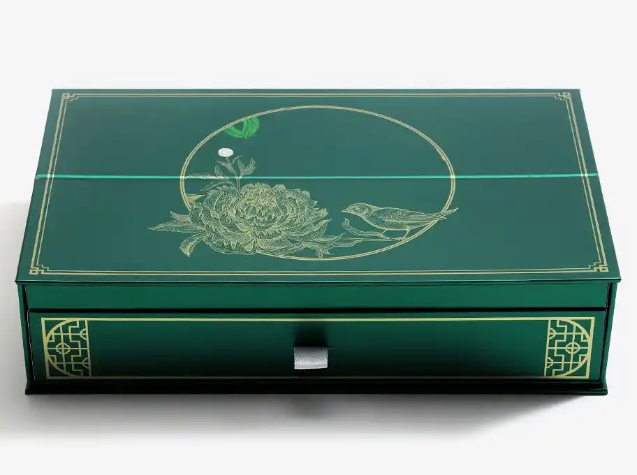
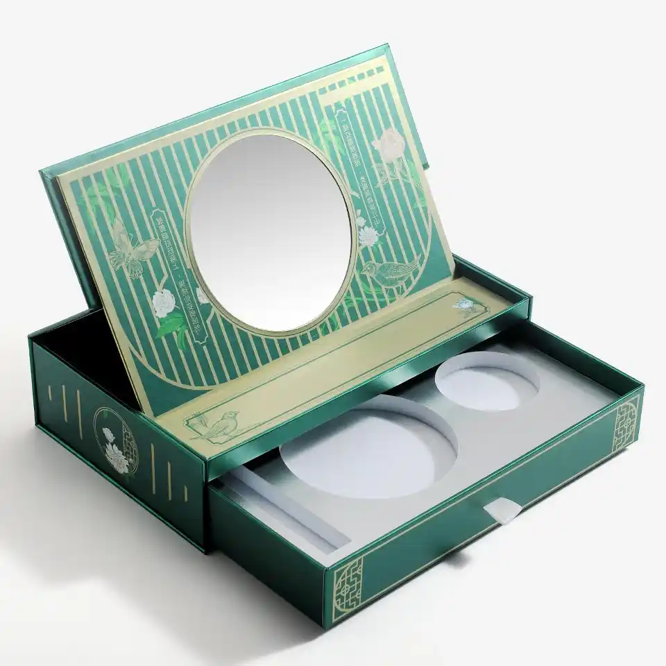
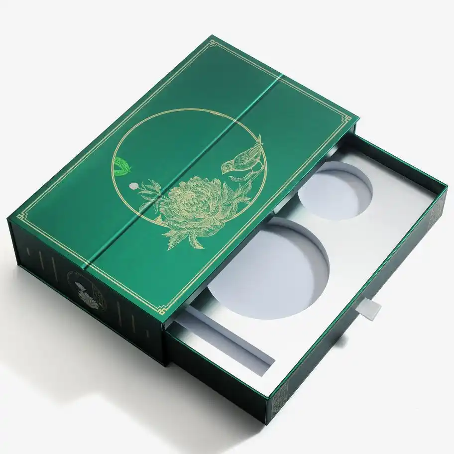
Holiday or limited sets? People pay for the moment. This is where rigid + drawer + shimmer effects make sense, because the packaging becomes part of the “gift value.”
This drawer example shows that collectible vibe: Holographic Rainbow Drawer Gift Box for Cosmetic Packaging.
If your product is glass-heavy (serum, fragrance, thick jars), don’t gamble. Use a strong shipper, then make the inner pack premium. That’s how you avoid crushed corners and angry emails.
Start here for outer protection: Printed Corrugated Boxes.
When you upgrade printing, your tolerance for mistakes goes down. A tiny registration issue on foil? You see it. A bad dieline? Your seams scream.
That’s why brands often prefer a supplier that can cover:
Zhibang Packaging positions itself as a global manufacturer for custom paper packaging—folding cartons, rigid gift boxes, and shipping solutions—supporting OEM/ODM workflows and worldwide delivery. If you’re scaling across regions, that operational discipline matters, because you need repeatability. Your box can’t look “different-ish” every reorder. That’s a slow brand leak.
If you want to explore the beauty lane first, go here: Custom Cosmetic Boxes. Then map the format to your channel (retail vs DTC vs gifting).