Talk To Our Boss If You Didn't Find The Solution
Our boss, Alanna will ask our team to find out the solution very soon! You must be satisfied with our services!


Funny thing: people think packaging ends at “pretty colors.” Nope. So here’s the truth (and I’ve been burned by this myself). Packaging makes or breaks the first purchase, and it can jack your legal risk if you ignore trade dress hazards.
Long forms matter because there’s more data now than ever—72 % of consumers say packaging design influences their buying choice, and 60 % actually put sustainability over brand name when deciding what hits the cart. Those aren’t my guesses, that’s cold numbers from industry research. Small print matters too—non‑compliance with recyclability labels in 2023 has already cost brands roughly $120 000 per incident in U.S. fines.
But before we dissect jargon like dielines and substrates, let’s start with the real architecture of this whole thing: purpose, protection, and psychology—tightly locked together, and often ignored by newbies.
One thing you should know: packaging isn’t a final touch, it’s a core part of the product experience. That means start with why the box exists, not how it looks. That’s the ugly truth most “design tutorials” never tell you.
Crazy thought. But ask yourself: does this design communicate your brand before the customer even sees the product? If not, you’re already late.
You want information hierarchy, not decoration. You want the consumer’s eyeball moving in the order you intend it to, or you blow shelf opportunity. And this isn’t some wishy‑washy guru talk—this is backed by logo saliency and visual attention research that shows how typography and brand signal placement dramatically change recall and choice.
Protective Shell Forget pretty prints if the product arrives crushed. Pick your substrates—rigid board, corrugated kraft, molded pulp—with the real world in mind: transit crush, humidity swings, drop heights, temperature flux. I learned it the hard way when a client’s imperfect clause in specs led to a weekend recall.
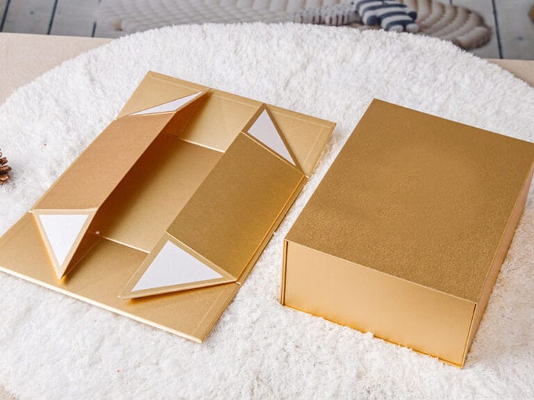
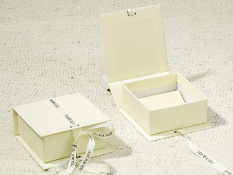
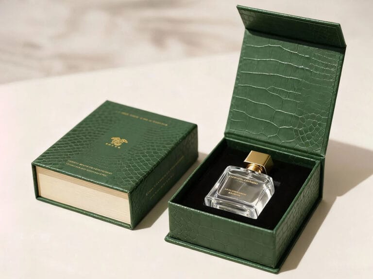
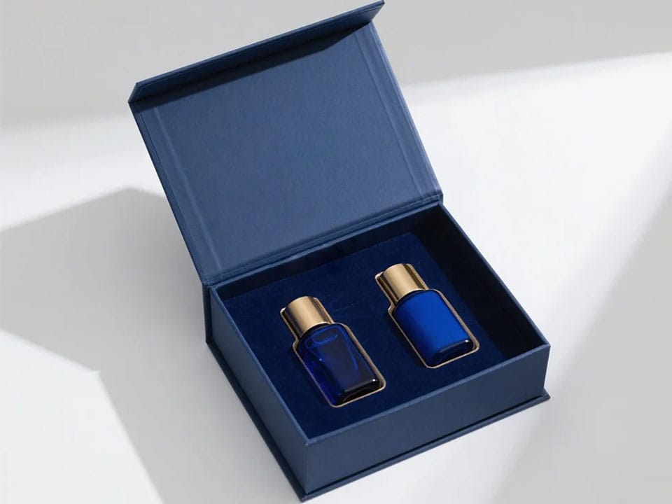
Perception (the emotional bit) From my experience, consumers don’t think “nice.” They feel “nice.” That’s why structures such as the satin‑lined magnetic closure satin‑lined magnetic closure gift box elevate unboxing and allow brands to command premium position. If you’re selling luxury or giftable goods, that structure matters to ROI—but not for every product. Choose with intention.
I’ll walk through what matters before you hand off to a printer or supplier. These are steps that separate mediocre from strategic.
1. Define What It Is and Who It’s For Stop thinking of packaging as art. Think of it as communication and engineering. What is your audience expecting? What shelf cues trigger purchases? Hell, denote where the product will sit—e‑commerce thumbnail or retail gondola—because that dictates a totally different approach.
2. Dielines—Blueprints That Aren’t Optional If you ignore your dieline, your printer will interpret your design—and you’ll pay extra for that mistake. Panic sets in when you see panel elements get cut off or misaligned prints because someone didn’t mock up a proper dieline. It’s the structural DNA of your package. I frankly believe skipping dielines is industry malpractice.
3. Brand Signals and Visual Hierarchy A subset of this (and worth nerding out on): logo size, type scale, contrast, and whitespace. These aren’t aesthetics—they’re signals that the brain interprets before it reads anything. Think in gestalt, not clip art.
4. Material Choices Based on Reality Everything from sustainability to tactile feel impacts consumer perception AND compliance. Sustainability isn’t just buzz—it’s backed by facts like 55 % of consumers willing to pay extra for recyclable or reusable packaging.
That’s huge. If your product packaging looks cheap or wasteful in 2026, you’re not just out of trend, you’re out of sales.
5. Prototype and Test Like You Mean It Get hands on. Rapid prototyping (3D printing, physical mockups) trims development time and shows you issues no screen ever will—like panel floppiness or misprinted finishes. And use a lightbox or photos on mobile thumbnails—because online visuals are now part of your packaging evaluation.
6. Spec It Out for Manufacturing Don’t send half‑thought files. Your supplier needs dielines, CMYK color profiles, finish specs, emboss/deboss instructions, fold sequences—details that define how the package actually gets built. Major missteps here cost weeks and thousands in reprints.
| Structure | Use Case | Pros | Cons |
|---|---|---|---|
| Rigid Magnetic Gift Box | Premium beauty or tech | High perceived value, reusable feel | Steep unit cost |
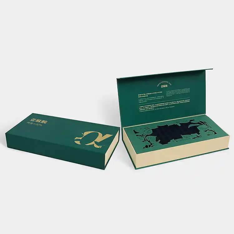
| Custom Book‑Shaped Box | Story‑driven brands | Memorable, stands out | Complex, longer lead times |
| Satin‑Lined Magnetic Closure Box | High‑end accessories | Elegant unboxing, protects product | Cost premium, slower production |
| Standard Retail Box | Commodity goods | Cost‑efficient, simple | Low shelf impact |
That table isn’t pretty. But real designers choose based on context, not trend posts. For example, a satin‑lined magnetic gift box is a damn good choice when the tactile reveal is part of the selling proposition, unlike a simple fold‑top used for basic consumables.
Here’s where most guides go silent—and here’s where you can get burned: trade dress and look‑and‑feel issues in packaging are litigated. Real legal fights are happening (and brands lose money).
For instance, a grocery chain faced a lawsuit accusing them of ripping off packaging cues so closely (colors, layouts, imagery) that a snack maker said consumers could be confused—and that’s not hypothetical. That one went to federal court in Illinois.
Australia had its own knock‑on case, where a supermarket’s children’s snack packaging was ruled to infringe on a rival brand because it was virtually benchmarked off another brand’s design.
Here’s the ugly truth: brand owners now push trade dress claims based on overall visual impression, not just registered trademarks. So your packaging outing might suddenly be a legal war zone if you blindly mimic others.
Consider packaging comparisons, color layouts, and type scale before you lock in a look that’s “just like” another product on shelf.
What does packaging design actually mean? It’s the multi‑disciplinary process of engineering a product’s enclosure to protect it, communicate value, align with brand signals, and perform in real markets, not just look good.
Where do I start designing packaging for a new product? First define audience and function, then make structural dielines, pick your materials, craft hierarchy, prototype, test, and finalize specs for your manufacturer.
What materials are best for eco‑friendly packaging? Look for recycled board, compostables, moulded pulp, and high‑recycled content substrates—those get you sustainability cred with consumers and regulators. Research shows over 60 % of shoppers want less waste and minimal designs.
Why do dielines matter? Because they’re your structural map. Without them, printers guess—and mistakes lead to waste, delays, and extra cost. There’s no shortcut here.
How can packaging design avoid legal trouble? Don’t mimic competitors too closely. Legal cases now hinge on look and feel, not just trademarks, meaning color schemes and layout similarities matter legally.
Want help shaping the dieline or materials strategy to fit your timeline and audience? I can walk you through a real plan that doesn’t fall apart halfway through production.