Talk To Our Boss If You Didn't Find The Solution
Our boss, Alanna will ask our team to find out the solution very soon! You must be satisfied with our services!


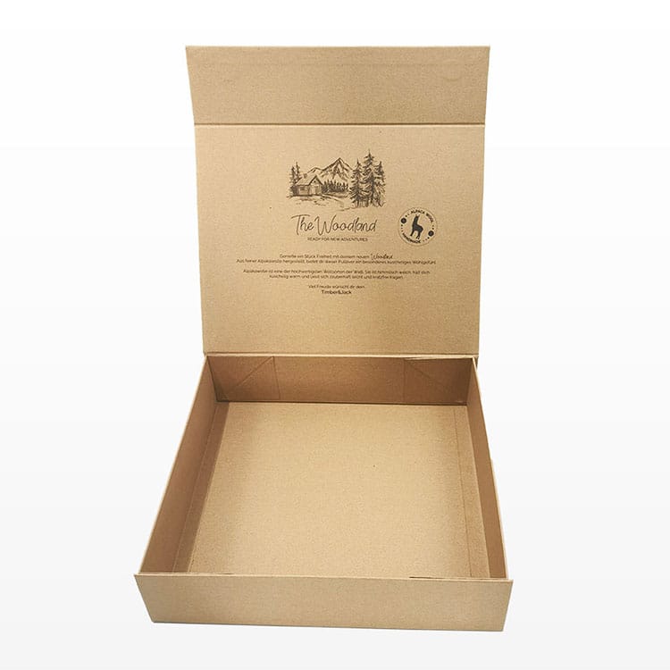
Kraft eats color.
I’ve watched too many teams approve a gorgeous on-screen CMYK comp, then act surprised when the press sheet comes back low-contrast, warm-shifted, and fuzzy at the edges—because brown kraft isn’t a “paper choice,” it’s a color filter plus a sponge, and it punishes lazy separations, lazy ink selection, and lazy proofing.
So why do people keep treating it like white SBS?
Shenzhen Zhibang Paper Packaging and Printing Co.,Ltd
Here’s what’s happening in plain manufacturing terms. Brown kraft has a lower L* (it’s darker), a warmer b* bias (it’s yellow-ish), and usually more absorbency + more surface texture than coated boards. Translation: you lose contrast, you gain dot spread, and your cyan/blue range collapses first.
If your supplier tells you “full-color kraft paper color printing is easy,” they’re either (a) running a white base, (b) running a coated/treated kraft that behaves nothing like the cheap stuff, or (c) letting you pay for disappointment.
And yes—this gets messier when you’re in food packaging or anything grease-resistant, because the coatings brands used to lean on are getting squeezed out by regulation. Washington’s ban on certain plant-fiber food packaging with intentionally added PFAS started Feb. 1, 2023 and expanded May 1, 2024. That’s not a vibes shift; it’s a substrate + coating supply-chain shift.
Some brands want kraft because it whispers “eco.” Fine. But you can’t also demand neon candy colors without paying for the physics workaround.
You have three honest options:
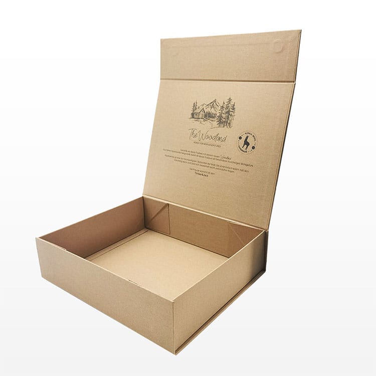
If you’re selling premium presentation, kraft can work beautifully in structures like Kraft paper gift boxes or rigid setups where the tactile story matters more than screaming saturation. But if you need “vivid,” don’t pretend you don’t.
Direct CMYK on brown kraft paper can be clean, but you have to stop chasing “match the monitor” and start chasing “repeatable, readable, intentional.”
What I do in prepress when I’m not in the mood to burn money:
If you’re building retail cartons, make your structure + print method match: custom folding cartons behave differently than corrugated, and “sharp” means different things on each.
White underbase fixes two big problems: it raises your L* locally (more brightness) and it blocks brown show-through. But it’s not free.
What I’ve seen work reliably:
White ink is usually loaded with titanium dioxide (TiO₂) for opacity. If your supplier is cheaping out on white laydown, your “clean and sharp” colors still look dusty.
Also: if you’re in regulated packaging, read the fine print on coatings/inks. Minnesota’s law defines “food package” components to include coatings, inks, and labels, then prohibits food packages that contain intentionally added PFAS. That’s a legal definition that can reach further than teams expect.
Three words: toner sits.
Laser printing fuses toner onto the surface, so edges can look sharper than dye-ink inkjet on uncoated kraft, but heavy coverage can crack on folds and the fuser heat can warp thin kraft—especially if you’re feeding 80–120 gsm sheets meant for craft, not production.
Inkjet varies wildly:
If you’re doing prototypes at your desk, test with a real file, not a screenshot. And don’t pretend a home proof predicts a production run—different ink chemistry, different drying, different pressure.
For packaging-scale print, I’d rather you spend that energy on proof discipline. Zhibang’s guide on when to use white samples, digital proofs, or full printed prototypes is the kind of boring process content that saves you from expensive surprises.
Price pressure is real, and it shows up in how hard suppliers push “good enough.” The U.S. BLS/FRED producer price index for Corrugated and Solid Fiber Box Manufacturing moved from 423.337 (Dec 2023) to 444.460 (Dec 2024)—about a +5.0% rise, which is exactly the kind of shift that makes vendors cut corners on inks, plates, and QC unless you force the spec.
So yeah: if you want clean, sharp color on kraft, you’re either paying in process discipline or paying in waste. Pick one.
| Process | Best use on kraft | Typical detail | Color outcome on brown kraft | Setup/MOQ | Notes |
|---|---|---|---|---|---|
| Flexo (water-based) | Large runs, corrugated + simple graphics | ~100–150 lpi (varies) | Good solids; gradients risky | High setup, low unit cost at scale | Anilox + ink viscosity control makes or breaks “clean” |
| Offset (sheetfed) | Folding cartons, finer detail | ~150–200 lpi (varies) | Better detail; still muted without white | Medium-high setup | Needs smart curves; watch setoff on uncoated |
| Digital UV inkjet (with white) | Short runs, high-impact zones | 600×600 to 1200×1200 dpi (device-dependent) | Best “vibrant” path on brown | Low setup | White underprint changes everything; mind banding |
| Dry toner / laser | Short-run cartons, office proofs | Often “1200 dpi class” | Sharp edges; limited “pop” | Low setup | Heat + fold cracking can bite you |
| Screen (white + spots) | Logos, bold opacity, specialty panels | Very high opacity | Extremely clean where applied | Medium setup | Great for white zones; less ideal for photo CMYK |
If you need premium finishes to compensate for muted ink (foil, spot UV, emboss), don’t guess. Use a production-minded reference like printing finishes (foil, embossing, UV) for packaging and spec it like you actually care about scrap rate.
Printing on kraft paper means laying ink or toner onto an uncoated, naturally brown sheet whose base color and absorbency shift your intended CMYK values, increase dot gain, and lower contrast, so you must design and separate files specifically for that substrate rather than treating it like white coated stock.
Start with a proof on the exact stock, reduce TAC, thicken fine lines, and favor flat graphics over delicate gradients.
CMYK on kraft paper is the four-color process printed directly onto a brown substrate where the paper’s warm tint and absorbency compress the color gamut, making blues, light tints, and subtle gradients look duller and less separated than they would on white board, even with good calibration.
If “sharp” is the goal, use stronger contrasts, fewer pastel tones, and consider adding a white print zone under key graphics.
A white ink underprint on kraft paper is an opaque white layer—usually titanium-dioxide (TiO₂) pigmented—printed beneath your colored artwork to block the brown substrate from showing through, raising local brightness and contrast so subsequent CMYK or spot inks appear cleaner, brighter, and more legible.
Use it selectively: logos, type, barcodes, product names. That keeps cost down and preserves the “natural” kraft look elsewhere.
Laser printing on kraft paper is a toner-fusing process where plastic-based toner is heat-bonded to the surface, typically giving crisper text edges than dye-ink inkjet on porous kraft, while inkjet relies on liquid inks that often wick into fibers and can feather unless pigment inks or treated kraft are used.
For office proofs: laser for sharp text, pigment inkjet for better solids if the kraft is less absorbent. For production: choose based on run size + whether you need white underbase.
The best ink for printing on kraft paper is the ink system that matches the substrate’s absorbency and your durability needs—commonly higher-opacity water-based or UV-curable inks for packaging, or pigment-based inks for desktop inkjet—so the color sits cleanly without excessive bleed, washout, or scuffing.
If you need “vibrant,” prioritize processes that support white underbase and controlled curing/drying.
If you want clean, sharp color on kraft, don’t ask your supplier for “nice printing.” Ask for a proof on the exact kraft, the TAC limit they’ll run, whether they can do white underprint, and what they’ll do about dot gain compensation.
If you’re speccing boxes right now, start by matching your structure to the print reality—look at printed corrugated boxes for shipping-first needs, or paper tube packaging when you need a premium feel—and then build the artwork to win on that surface, not fight it.